Hello from Castrum Lusitania, my fortress in northern Portugal. Welcome to another edition of our weekly newsletter, where we’ll explore my current gigs, see exclusive previews, sneak peaks, works in progress, overviews of past works, recommendations and more.
Today we’re going to walk through the process of one of my commissions, using my latest as an example. There’s lots of images, so make sure you click "View entire message" if your email provider truncates it.
How it begins
It usually begins with an email from the client. Sometimes it’s people that follow me on social media, other times readers that track my website and reach out. Some artists have a number of slots per month and year and announce it on their social media accounts, but because I do a limited number of commissions (I prefer to dedicate most of my time to create stories) and I receive frequent(ish) requests, I haven’t announced slots in years. If in the future I do, it will be through this newsletter first.
I have all my original pages ever published, so commissions are the only way (for now) for people to have original art from me. As the years went on I upgraded my commissions to be as good as possible and to make sure the client gets something worthy of their money. Right now, I draw them in ink in good quality paper with screen tones used for lighting and tones.
Clients will often have a few ideas for me to choose from. Something along the lines of “Character x doing y”. I’m happy to abide since this is something literally done for an audience of one. Let’s take a look at my latest commission, featuring Wolverine sitting on a pile of corpses of the ninja group The Hand:
Idea sketches
Once I accept a commission gig, I’ll go through the client’s ideas and select those which I like the most in case there’s a lot of them. Then I’ll present two or three ideas of how things can be. If the client wants a very specific image, I sometimes send just one single sketch and we go from there. Usually, the client likes one right away, asking only for small additions. Again, being this a personalized piece of artwork, I’m always happy to include them.
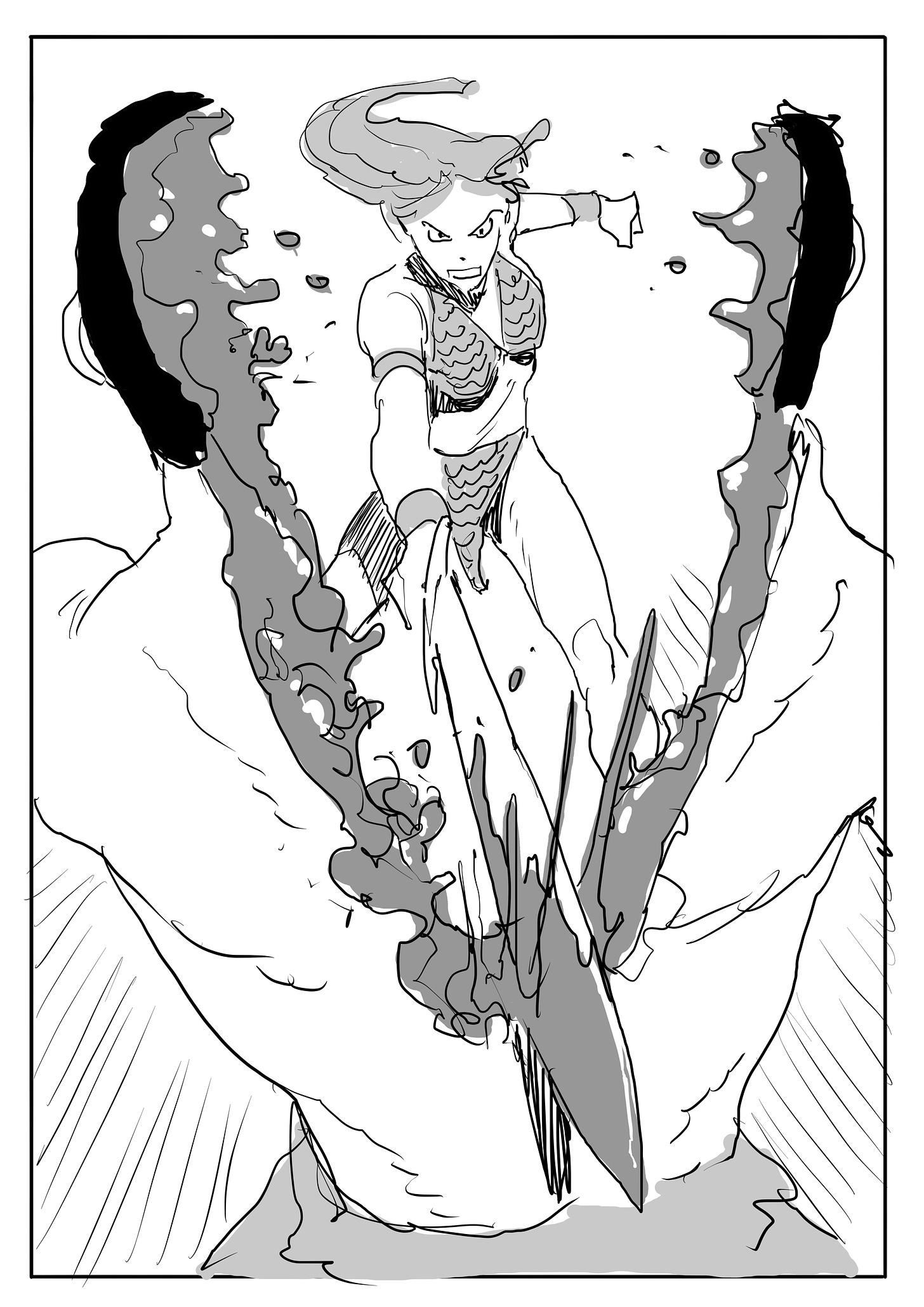
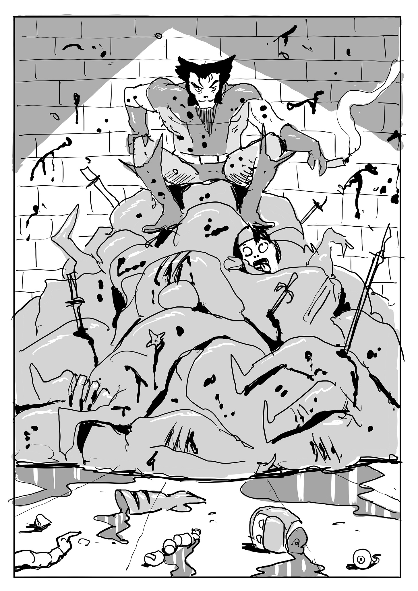
For my latest commission, the client offered a few possibilities, from which I drew three sketches for him to chose: A Harley Quinn smashing a car (based on a Geof Darrow’s cover for his book with Frank Miller, Hard Boiled), Red Sonja cutting a man in half and Wolverine vs The Hand, based on a cover I did for Mark Millar’s Kick-Ass.
Here are the three sketches:
The client had no doubts: Wolverine vs The Hand.
Pencils
Once the sketch is approved by the client (in this case, he asked for a few additions, like the eye balls and head in the foreground) I begin pencilling the piece. One of the highlights of doing a commission, is sending updates and previews to the clients. Since all of them are truly comic and original art aficionados, they love seeing it and I love having such conversations with them. It’s part of the process. Here’s the first work in progress I sent:
And here are the finished pencils:
As you can see, things are kept loose in may parts, with me going tighter in the stuff that is in more need of precision: faces, hands, perspective grids and Wolverine in general, since he’s the highlight of the piece.
Inks
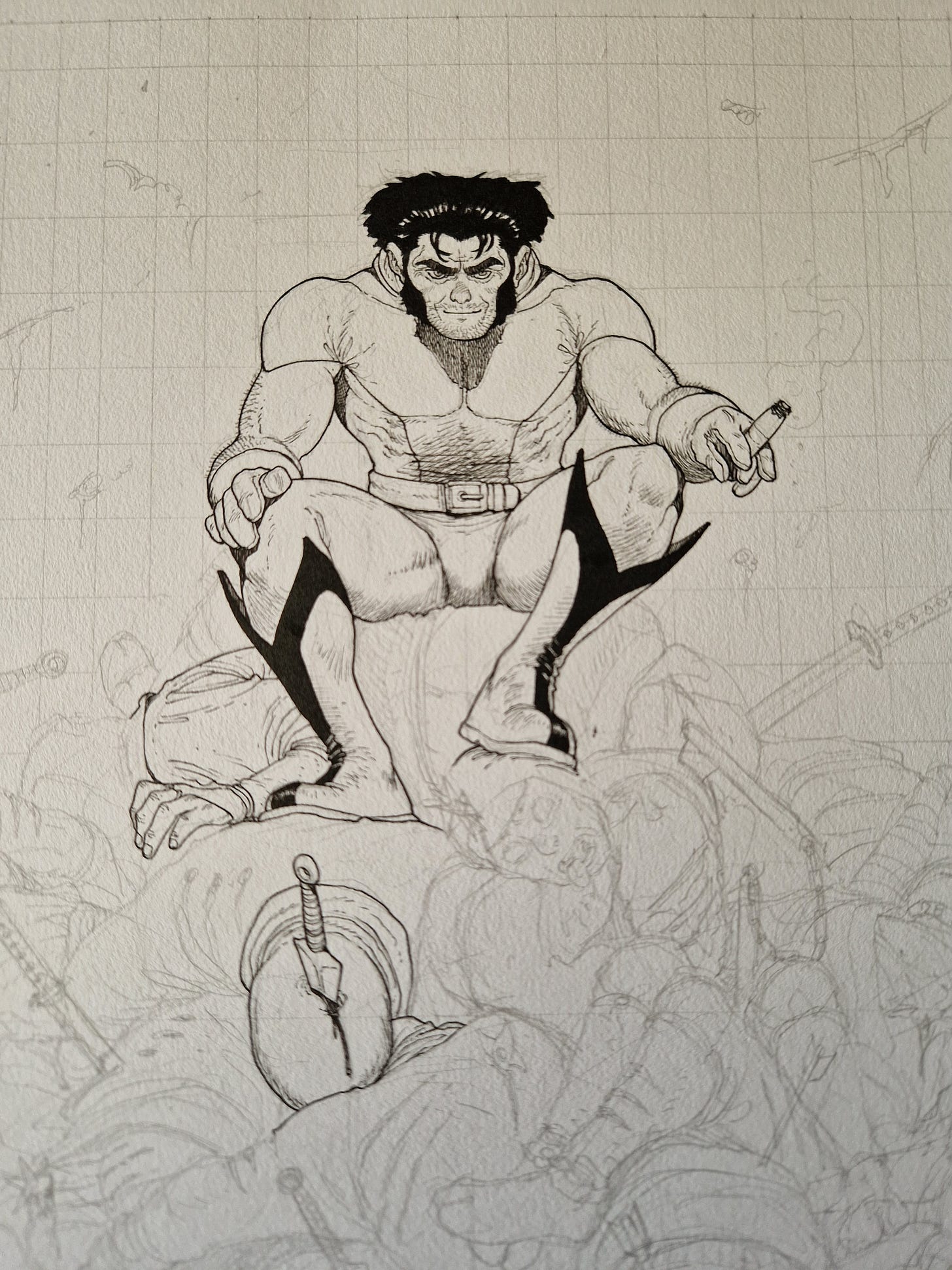
Now comes the nerve wracking part. Because this is all about the original piece, I want zero mistakes on it. Which I’m happy to say was the case on this occasion (as with the other commissions). But still, it requires a lot of concentration and extra care to make sure I get that result. Other than that, I ink it as I ink most of my work. Check below some WIPs:
The inks finalized:
And here the final inks adjusted:
With this part wrapped, comes the final step.
Screen Tones
I first select the tones based on the sketch that I did. In this case, I wanted two tones for Wolverine (light and dark) to emulate is brown and yellow costume. Then a light one for the ninjas (certainly lighter than Wolverine’s). I chose one with texture to differentiate it even further. Finally, I chose the same dark grey for both the top shadow and the blood in the bottom. The idea was to enhance the balance of the overall composition by having the same tone on top and bottom.
To cut the screen tones into the intended shape, I lay them on top of the inks. The tones and the paper they come glued to are semi transparent, so I use that to draw directly on the tone the shape of the thing I want. I then cut it with an x-knife, remove it and lay it on the paper itself. The tone adheres to the paper on its own, so no glue is involved.
On this specific case, for the dead ninjas, I cut the overall shape of the mass of bodies and then glued it to the paper. With it laid there I cut all faces, hands, feet and weapons. My intention was to keep the mass uniform, but with enough openings so you could read each ninja individually in an easy manner mid you wanted.
Finally, to do the highlights I scratch the screen tones very lightly, very similar to how you’d do some light pencils.
Take a look at some WIPs and details:
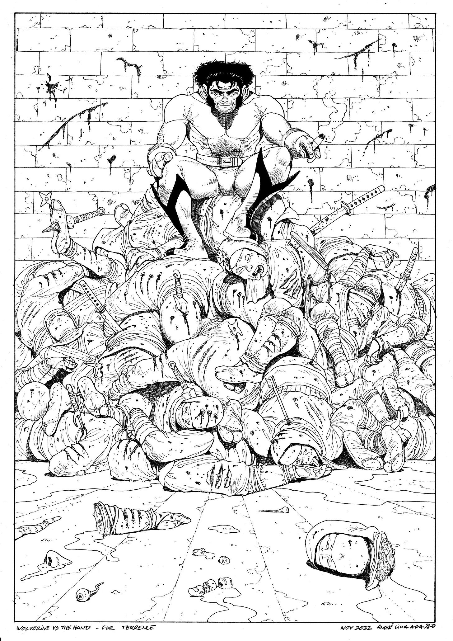
Finally, though I already posted the scan in the beginning, a picture of the final piece:
All the photos you can see here are stuff I sent to the client as I was working on it. In the end, I gather it all up plus hi-res scans of all the stages (pencils, inks and tones), both raw and adjusted scans. Finally, I carefully mail the piece - which I’ll admit to be the worst moment due to the uncertainty of transport. Whenever it arrives, there’s always a massive relief.
That’s all for this week. I hoped you enjoyed the longer post. As usual, comments and questions are welcome. I’ll see you soon,
André


Wonderful breakdown, thanks for sharing! Makes me want another one!!!
Fantastic!