Digital Pencils Part II
Printing and first ink lines + Mission Impossible 7 thoughts
Hello from Castrum Lusitania, my fortress in northern Portugal. Welcome to another edition of our weekly newsletter.
Digital penciling is all very nice and good, but if you want to ink your pages traditionally, you’ll have to eventually print them. So let’s see what steps were taken to ensure a smooth transition from the digital to the lovely world of paper and ink.
I also managed to return to the cinema after God knows how long and watched Mission Impossible 7. Being a big fan of the series, I couldn’t avoid typing a few thoughts. But first:
Printing Digital Pencils
On last week’s newsletter I explored why I changed to digital pencils and did a basic step-by step. A few days after that, I wrapped the penciling stage, which meant it was time to crack that ink bottle open.
Being all the pencils digital, I obviously needed to print them now. A whole new step in my process that bridges the gap between the digital and the traditional. Needless to say then, it’s an important one.
After doing some covers with this new process, I knew one thing: I cannot just print what I drew because it prints way stronger than what I see on the screen. Based on previous experiences, I went to the printer with files that had the pencils layer lowered to 30% opacity and that seems to be the sweet spot for me. It’s visible enough without the ink, but seems to vanish after the black lines hit the paper, such is the contrast. Which is what you want, because it allows you to easily see how your lines will look, without anything competing for attention.
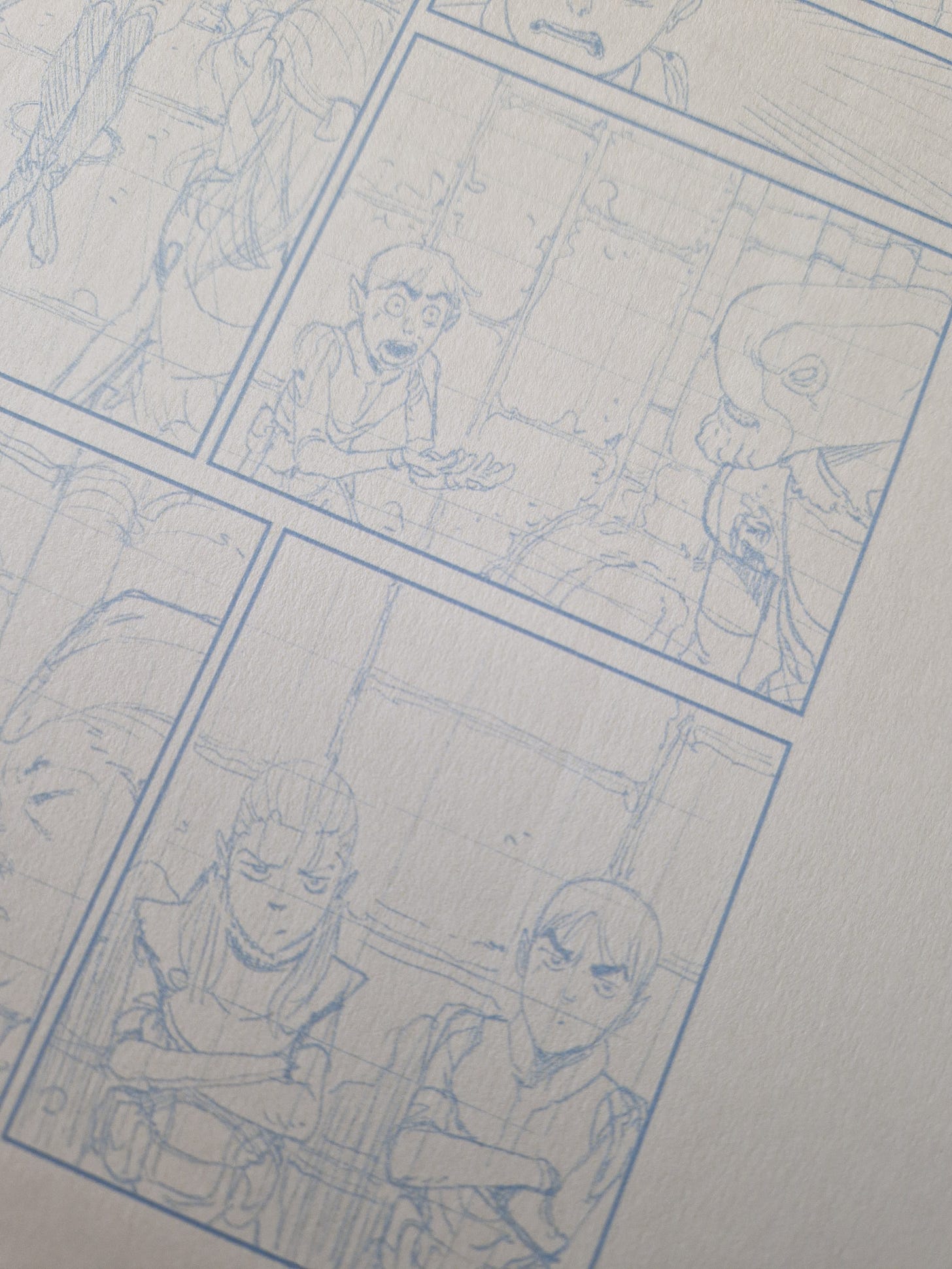
Here’s what the pencils alone look like:
Pretty decent, I’d say. And because I use the actual pencil tool from Clip Studio, they’re nearly indistinguishable from the real thing. You’d need to be an expert to tell the difference between these and traditional. That or try to erase them.
It’s very hard to notice on a picture, but Clip Studio allows you to export them with the trim marks, which is perfect. I export in TIFF and then print them on the same paper I’ve been using for all the other Phenomena pages.
I don’t print directly the TIFF file thought. I first place it on an A3 page in Photoshop and reduce it to the desired dimensions within the A3 size. Otherwise it would print the size of the paper, which would be a bit too big. I could go and print it to, say, 80% on the printer shop, but I prefer to show up with the something that they only need to print and avoid problems/complications.
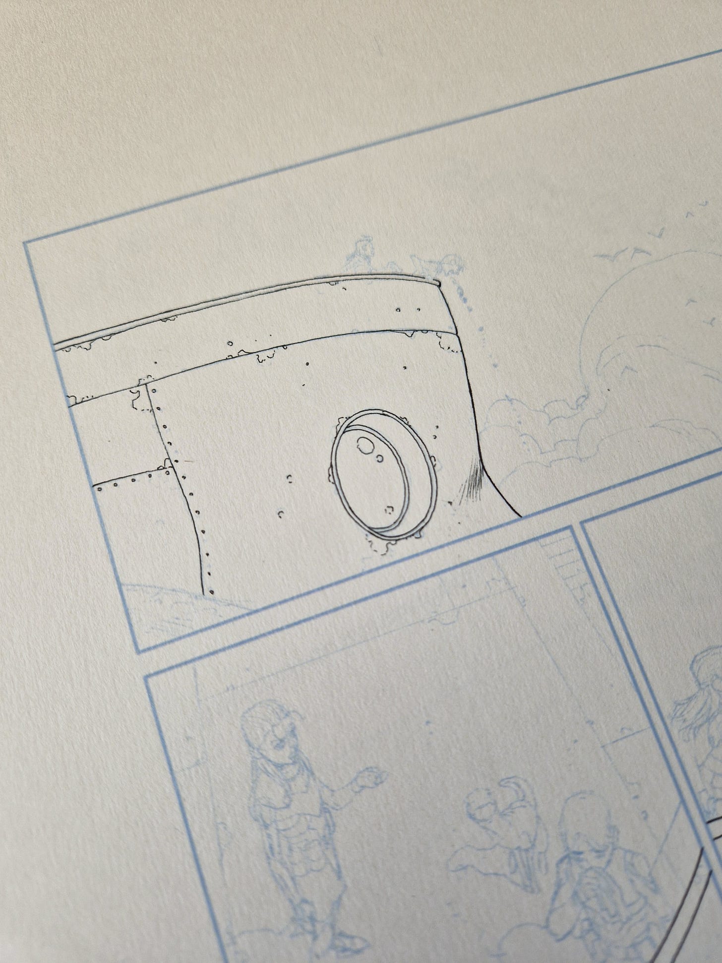
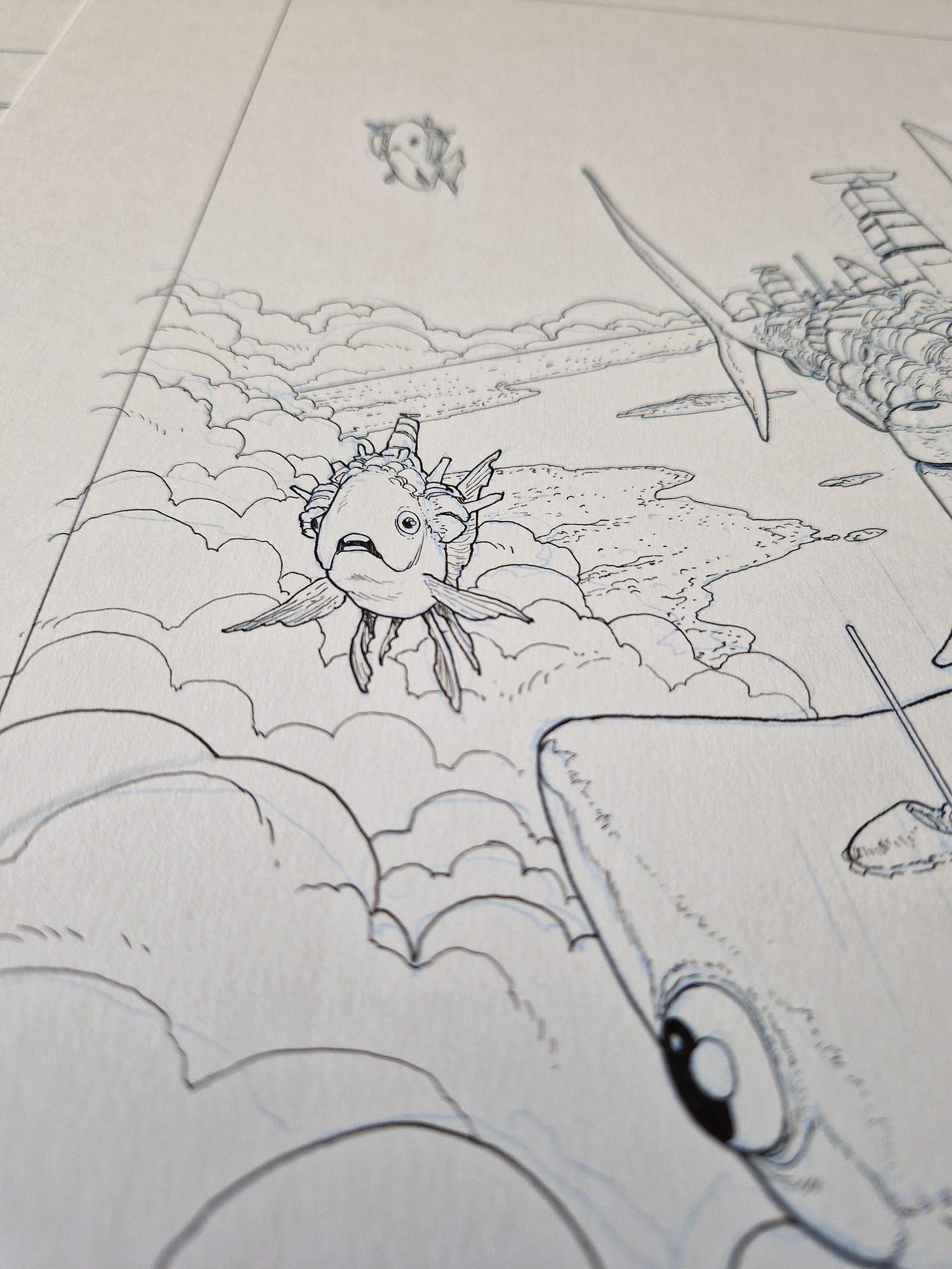
Below you have an half inked panel where you can see how the black line immediately pops agains the blue pencils:
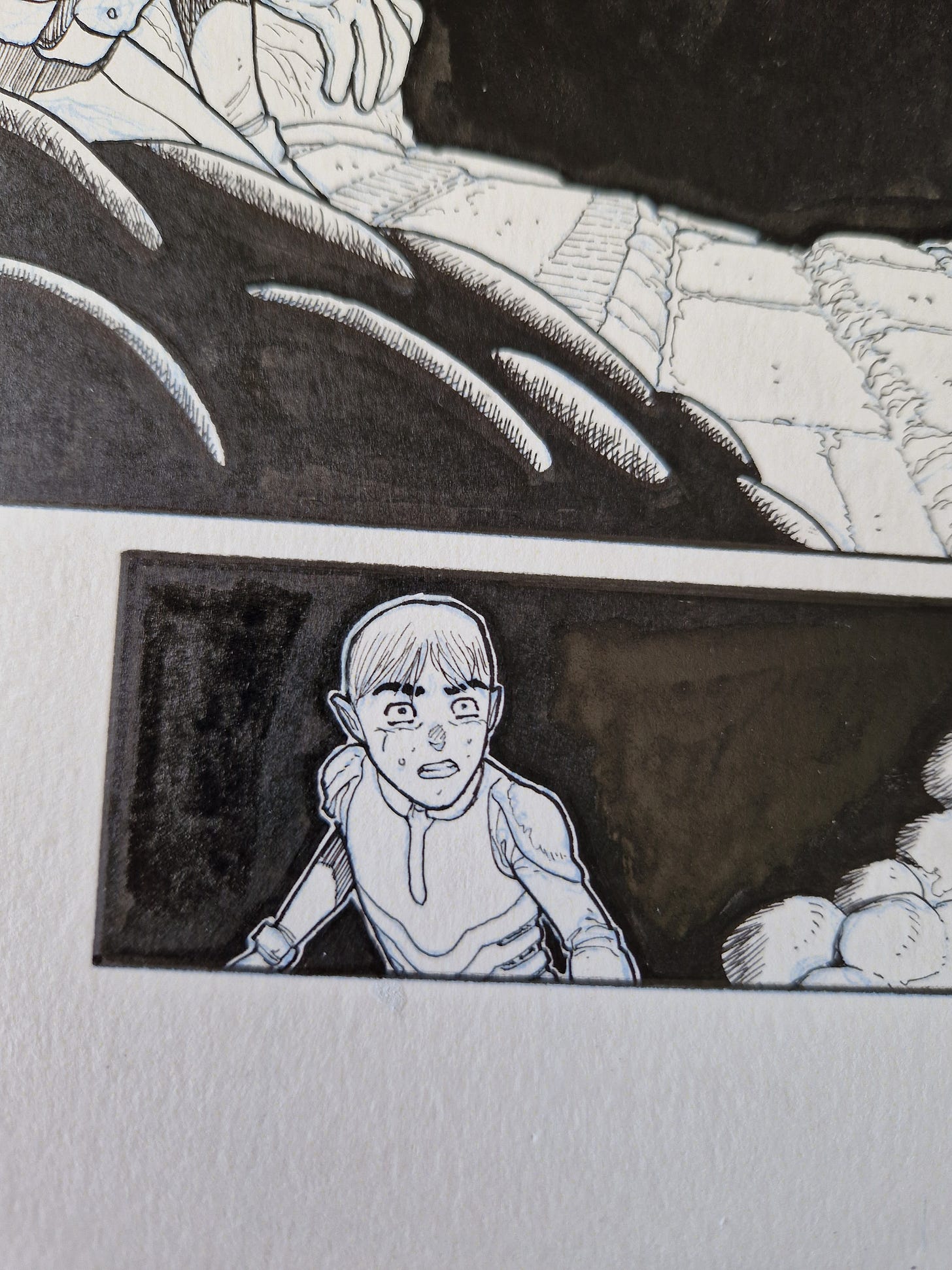
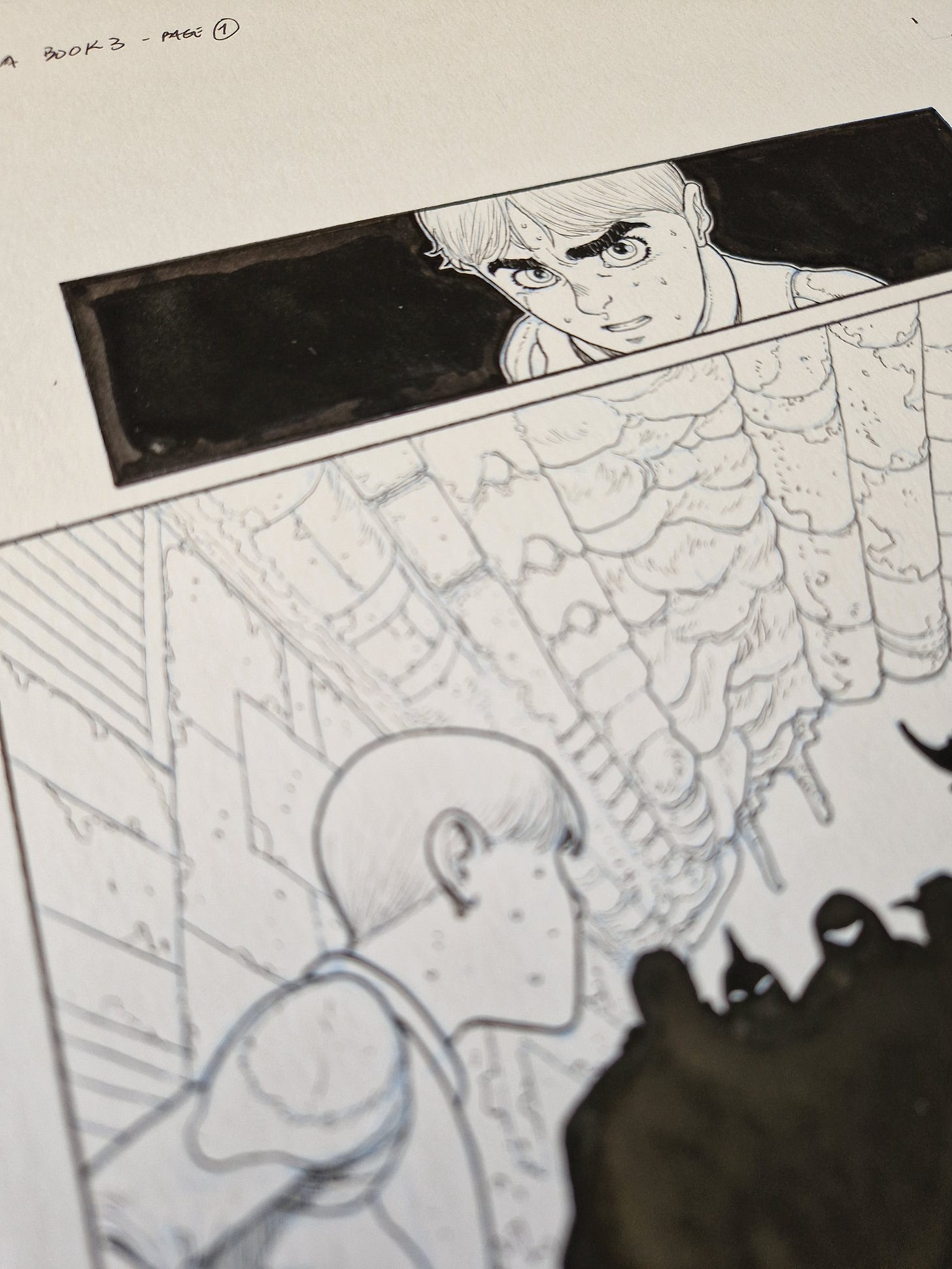
See also a few finished panels:
Apart from all of this Phenomena work, I also drew a cover for something Brian Bendis is cooking and drew thumbnails for two more, which were enthusiastically received and will be completed next week.
Mission: Impossible – Dead Reckoning
Me and my wife managed to drag ourselves to a theater, which with 3 kids is not easy. But I have an amazing mom who took care of everything so we could go. We missed things like Top Gun Maverick or Dune already, so it was nice to catch this one.
I’m a huge MI fan and I think they are the absolute best in terms of blockbusters. Nothing tops them these days. The series changed dramatically in the first couple of movies, but after 3 it started to become the thing it is today. MI 4, 5 and 6 are some of the finest action thrillers I’ve ever seen, so my expectations were pretty high.
And Dead Reckoning did not disappoint. The standards set by its predecessor - MI Fallout - were impossibly high, so I don’t think this one is better. BUT it’s an incredible achievement nonetheless. Fallout had everything, after all. It was a very classic spy movie, with nuclear bombs falling into the wrong hands, with perfect villains and stunning set pieces. On top of that, brilliant characters gave an incredible emotional weight to every big moment. Reuniting with Ilsa. Facing Solomon again. Luther. Benji. Hunley’s sacrifice. Finding Julia.
And I think this played very much into what the next movie became and the decision to split it into two parts. It was the only way to make it bigger. Without spoiling, I’ll say that the first third, while being brilliant, made me worry a bit as it was, a times, pure comedy. Very good comedy, don’t get me wrong, but not what I was expecting. But then came Ilsa, rescuing the tone and the feel of what a MI movie is. And that’s when I started noticing: the tonal shifts of the story were all headed by the women. Hayley Atwell, Rebecca Ferguson, Vanessa Kirby and Pom Klementieff. All of their characters guide the emotional shifts, from comedy to tension, love, terror, fear. Their acting is immense.
One of the reasons for it is that Tom Cruise, which is very good at many things, is especially good at putting the spotlight into the rest of the cast. He has plenty of bits where he shines, but he’s not greedy and everyone has their moment in the sun. Not in patronizing way, but in an earned way.
And again, they link the big set pieces to the emotional journey of the characters. They never feel an empty exercise of spectacle, there’s always tension and something big at stake. I’m eager to see part II and how they handle the structure of it, since it’s a direct continuation of another movie. Interestingly, with part I they managed to give us something that feels rather complete, despite the obvious open ending.
I highly recommend it, particularly if you have enjoyed the last few movies of the series.
It’s all for now, I’ll see you soon!
André



Always a pleasure to see your WIP stuff. Thanks for sharing Andre! On your last newsletter, you showed how you use the perspective guides for straight lines and to make grids. It was really helpful! But how do you deal with stuff that doesn't work with the perspective rulers as well (stairs, tilted objects, etc)? Is that more intuitive for you at this point?
What kind of printer and paper do you use? I love pencilling in CSP but really want to get back into inking traditionally again.