Hello from Castrum Lusitania, my fortress in northern Portugal. Welcome to another edition of our weekly newsletter.
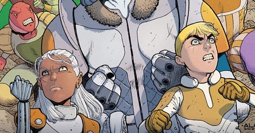
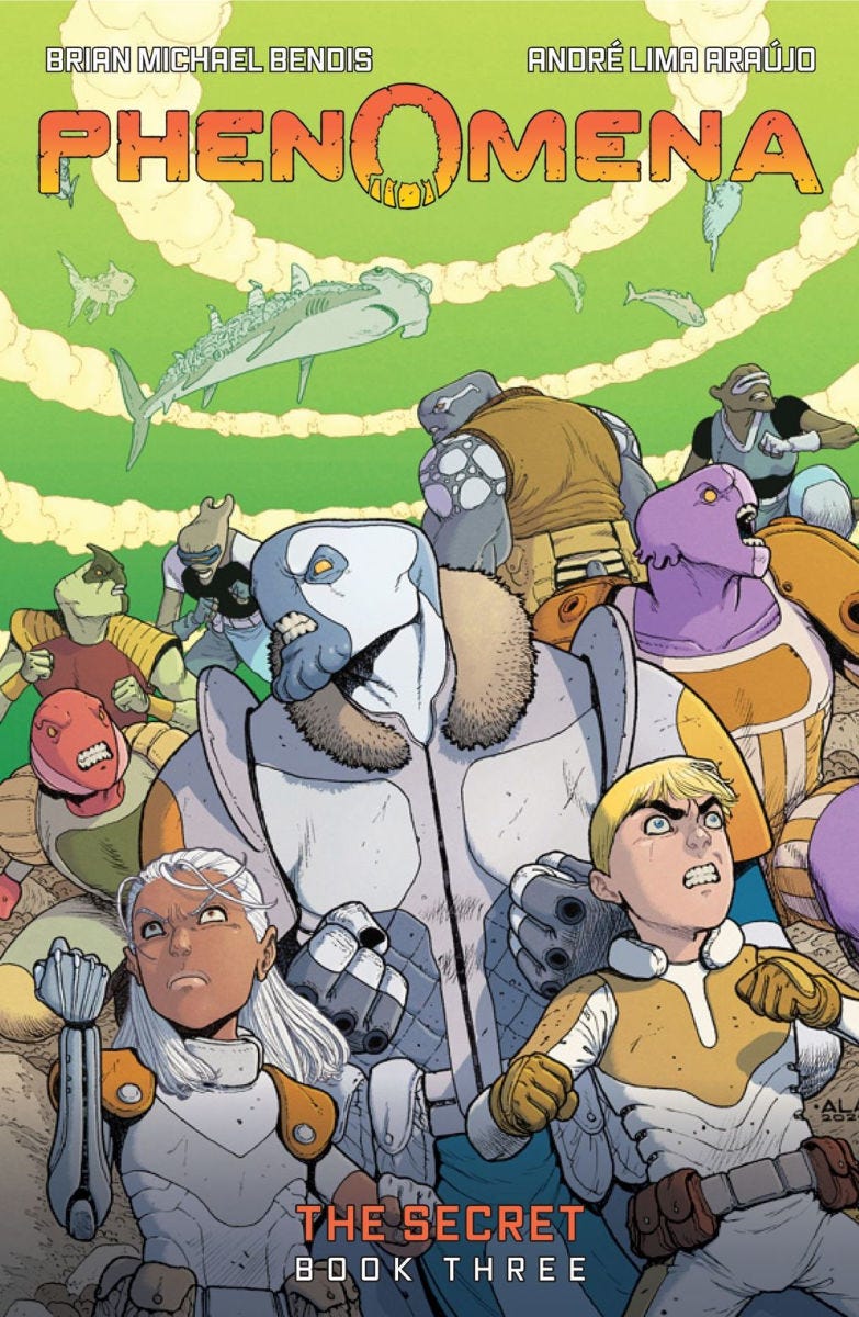
After a couple of weeks of traveling, vacations and work, we’re back and with a good one: Check your local comic store or online retailer because Phenomena Book 3 preorders are now live! And with it comes the cover reveal:
Titled The Secret, get ready to go even deeper on the origins of the world of Phenomena and see our characters navigate plenty of adventures. Brian nailed it in these excerpts of the official text:
Phenomena is the story of a young boy named Boldon, a mysterious girl named Matilde, and the warrior Spike—survivors of a phenomena that took over Earth years ago. Not an apocalypse . . . something far more interesting.
(…)
In The Secret, the Phenomena trilogy comes to a thrilling conclusion. Brian Michael Bendis and André Lima Araújo pull back the curtain to reveal all the secrets behind their universe.
Naturally, I want to dive into that cover in detail but before that, a quick (but very important) update:
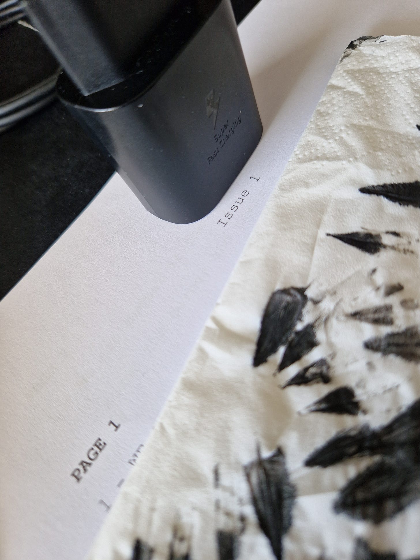
My next book has officially begun production
Here it is, those beautiful words: Issue 1, Page 1. A jolt of electricity hits the brain and just like that, it’s on. The book is now inevitable.
(as a quick recap, my next book is a brand new creator owned thing with Rick Remender)
Rick had already shared with me a couple of very rich and detailed documents, I had already drawn many characters and concepts for it, but when pages start to appear - written or drawn - that’s when it becomes real. The idea, no matter how polished, is just a figment of your imagination. Until you do some pages, there is no book.
But now there is. Half a dozen already penciled this week.
So. Very. Exciting.
And also so far away from even an announcement. But I’ll keep teasing.
Phenomena Book 3 Cover
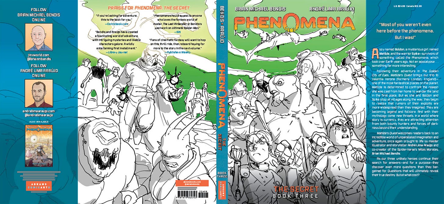
Like in the previous two, we went with a wraparound cover, which means that the full image is much larger than the front cover you see above.
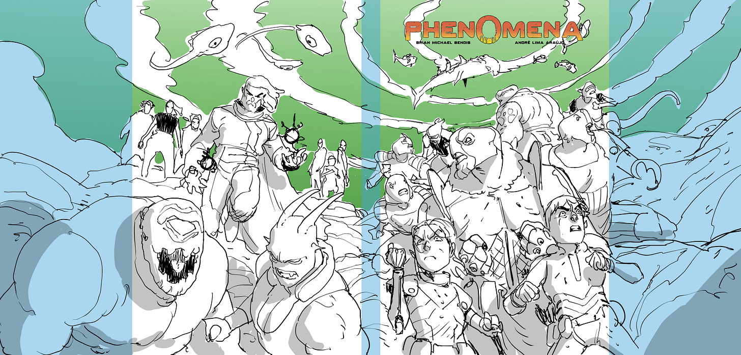
Brian had the idea for the initial concept, which was very simple but perfect for the story: two group shots - heroes in the front, villains in the back. I loved it and immediately went to work, showing the team the following sketch:
As you can see, I work right away with the logo and where the folded interior bits and the spine are (the light blue areas) so I can see exactly what gets covered and how to organized the composition.
For the front cover (the heroes side) I got our main trio front and center, with their companions right behind, but visibly smaller. For the back (the villains side), I centered the main baddie, pushing to the foreground two of my favorites from his goon gallery and lining up in the back the baddie’s entourage. Both sides contain flying creatures (neutral/good in the front, bad in the back) to animate things. I also have the characters facing different sides and in various positions to add to it a good sense of motion and of imminent danger from all around them.
My last concern was color. The first volume has a big purple sky, the second one an orange sky, so I felt green would be perfect for the final volume of the trilogy.
Happily, the cover was enthusiastically approved by Abrams and everyone from editorial, and I got sent this mock up back:
With this, I noticed how the baddie’s head was getting covered by some of the quotes and the logo was partially covering the flying shark. Even the rest to the drawing felt a bit more cramped with all the text in place, so I made a very simple but effective adjustment: I slightly scaled down each side to give it all a bit more room to breath and less crop to be had.
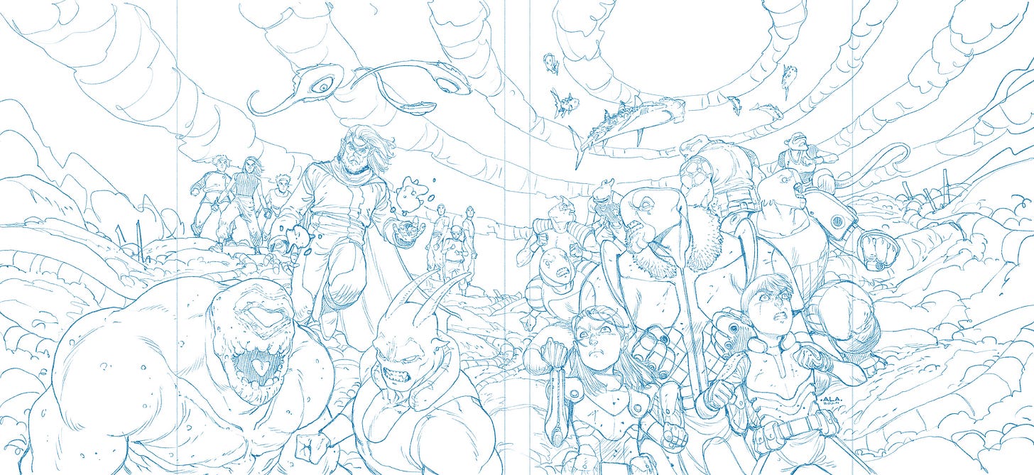
Using the adjusted file, now it was just a question of actually doing the thing. As usual, I penciled it digitally over the sketch you can see above:
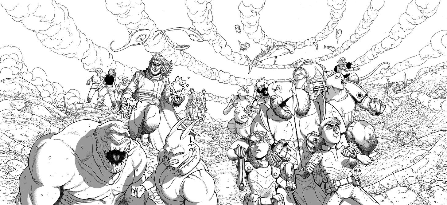
Inking this was a lot of fun. Throughout the three books I remained in deep love with these designs and doing all of the characters in one image was very satisfying. See below the thing with digital tones already added:
To really separate the planes, I used a couple of tricks: 1. Only the characters have tones, not the background. I left it for the colorist to render it. 2. Characters in the foreground have darker shadows than those in the background - just like happens in real life due to the atmosphere.
Then came Chris O’Halloran to complete his trifecta of Phenomena covers and lay down some truly magical colors on this one. I mean, look at this:
An explosive piece. I couldn’t be happier with it.
Now it’s on to you: Preorder it (it will be out in 2025), get the first two volumes if you haven’t yet. This is a book for the family to enjoy and have fun. At least, as much as we had in doing it.
Recommendations
I found this very poignant video about the current state of affairs in Hollywood that reflects many of my thoughts on it: it’s about the lost art of sincerity. You know, don’t take it too seriously, but some things… you have to. Otherwise, nothing matters. And if nothing matters, you don’t have a story. You might have a plot, but not a story. You know, one of those that makes you think, makes you happy, sad, in awe etc. If all it does is making you chuckle…
Well, rollercoasters are fun, but we’re in the storytelling business.
—
See you next week!
André





Beautiful work on the cover! I'm excited to read the story. I really appreciate your consistency in showing us your process. Looking forward to your new projects!
Another beautiful cover man! And congrats on completing the trilogy, that is one hell of an accomplishment! Absolutely looking forward to your next collab with Remender as well. RTFV has easily become one of my favorite comics of the last several years. Such a gut punch in every issue and your visual storytelling is a lesson unto itself. Keep up the great work!