Hello from Castrum Lusitania, my fortress in northern Portugal. Welcome to another edition of our weekly newsletter.
This week things are going to be pretty straightforward: It’s all about a first look into my work on The Sacrificers. If you read last week’s Castrum, you’ll know that my next thing will be a three issue run on this fantastic book by Rick Remender and Max Fiumara.
Image Comics put out a press release and showed some interior pages, so let’s take a look at what’s been brewing in the studio, with some exclusive goodies.
The Sacrificers #10 preview
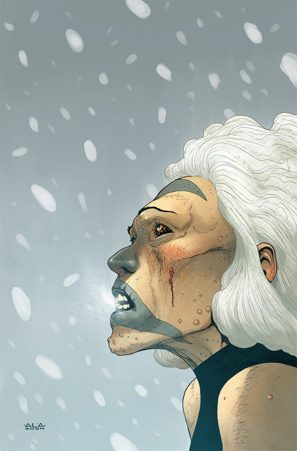
I’ll be doing issues 10-12 of this series. At this point, issue 10 is fully done on my end and I’m already well into penciling #11. The cover for 11 was also shown this week and you can see it here without the dressing (colors by Dave McCaig):
We’ll be breaking down both this one and the cover for issue 10 soon (most likely next week) with a step-by-step. But for now let’s focus on the pages.
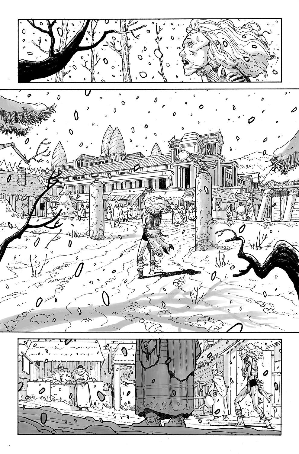
You’ll be seeing here the first four pages, which establish the new location and set the tone for the issue. Soluna (the main character in this chapter) is not doing so well and is trying to find a place to rest and something to eat. Deprived of her previous wealth and status, she finds herself in a dire and desperate situation.
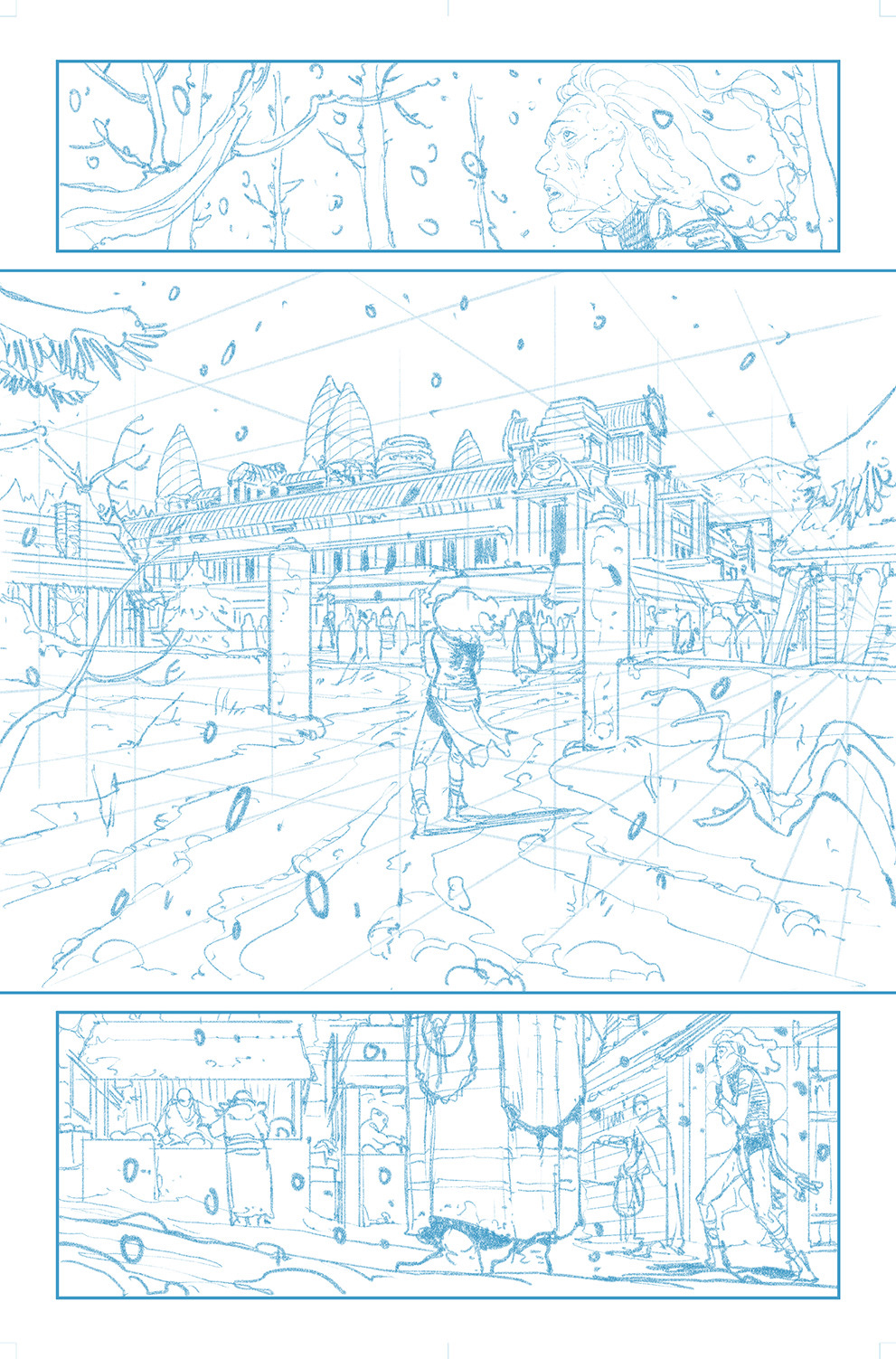
Page 1 opens up with Soluna arriving at the main location, a well kept human city filled with wealthy people. The script had just panels 2 and 3, but I added panel 1 to make a smoother transition between the cover and the first page, effectively turning the cover into an integral bit of the story. Speaking of it:
You’ll remember it from last week, but I’m adding it again to show the sequence properly. As you can see, panel 1 picks it up exactly where the cover left it, keeping the angle on the character with some added branches as the camera pulls back and reveals the new town:
Pencils for page 1:
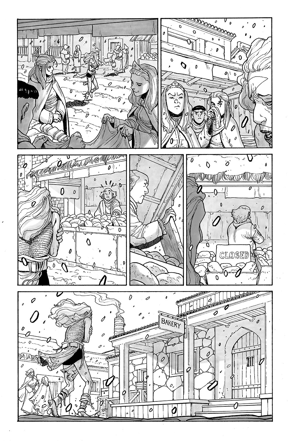
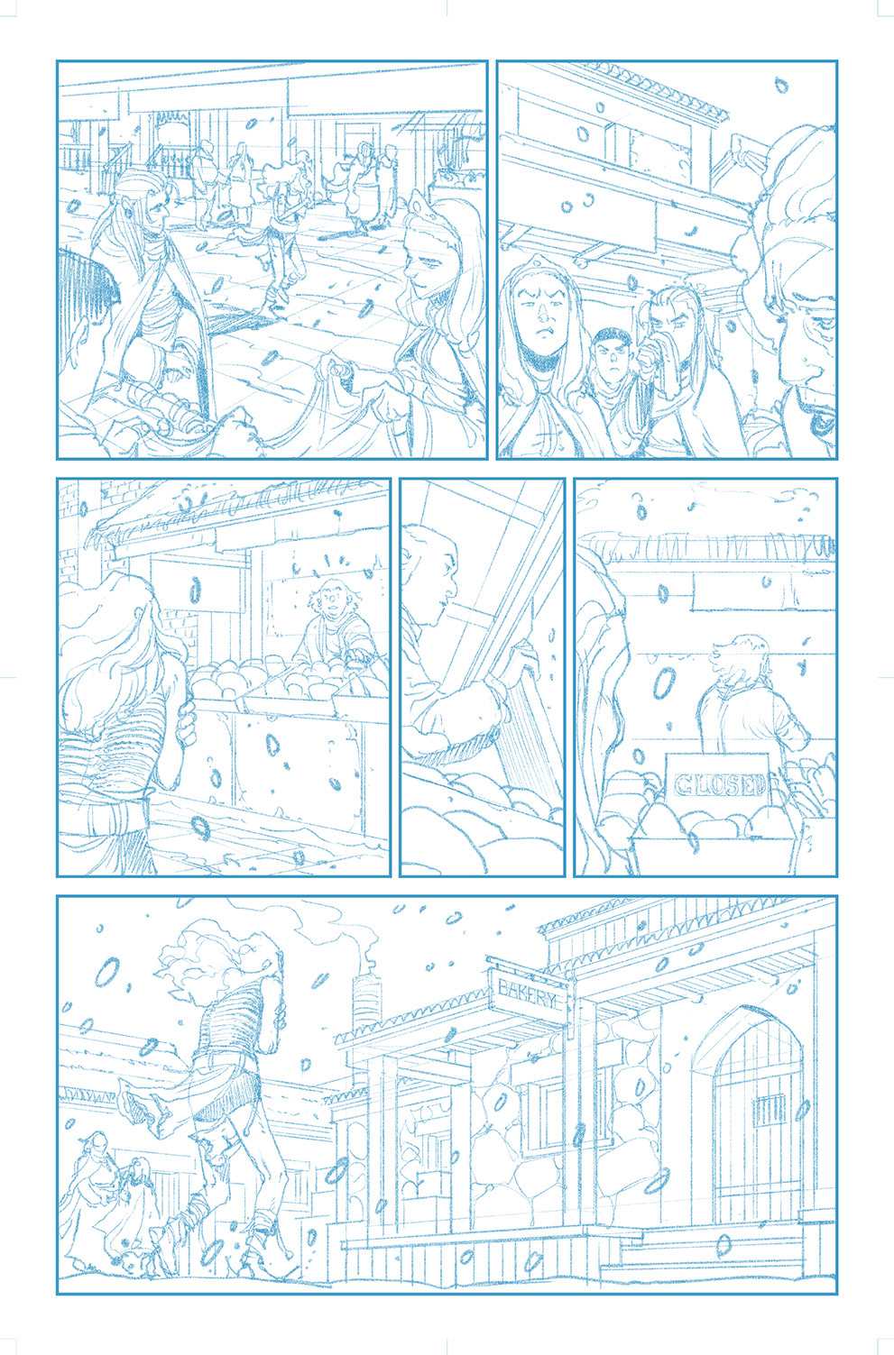
Soluna goes stumbling through the streets, looking for some kind of shelter and food. People around her are not amused by her presence and literally turn their backs on her. Eventually, she finds a cozy-looking bakery:
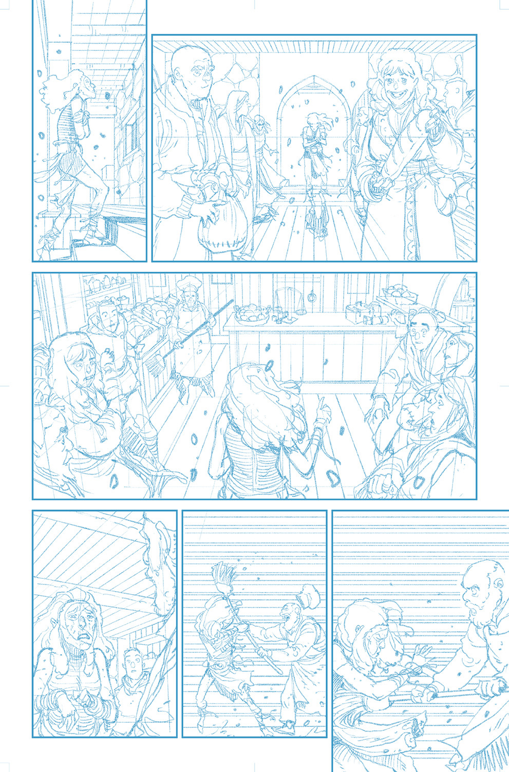
Pencils for page 2:
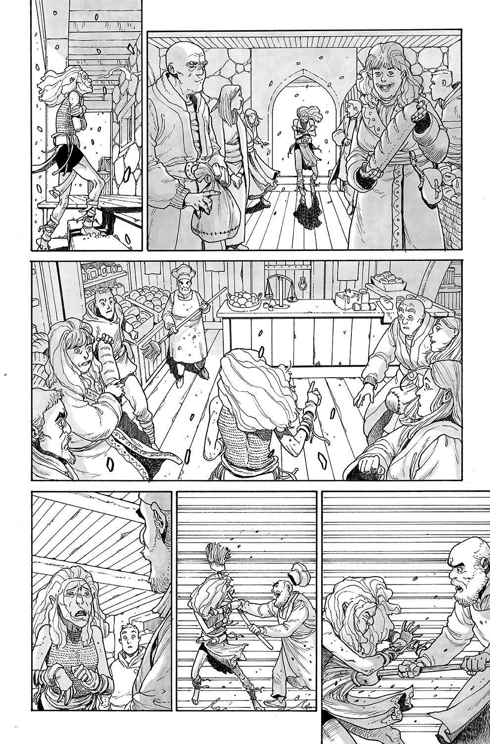
Unfortunately, inside she finds herself even less welcome. I had a lot of fun coming up with these rich folks and different kinds of bread. For the baker, I went with a classic look to make it all easily understandable as to who is who:
Pencils for page 3:
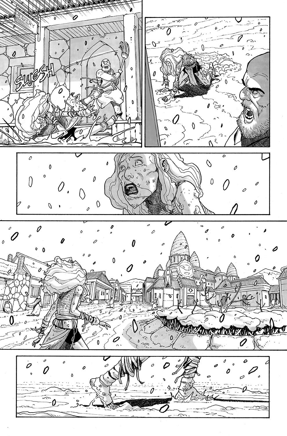
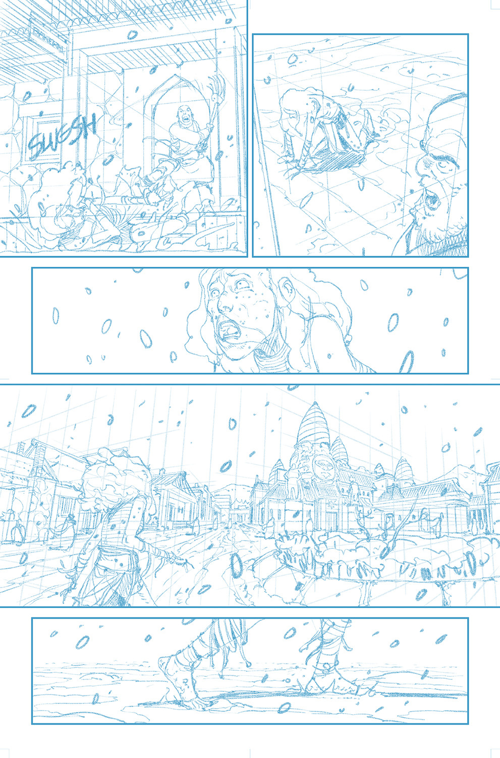
Thrown outside and down on the frozen mud, she sees a sign of hope: a church dedicated to her own father, Rokos. Maybe she’ll find some comfort there?
You’ll notice that the church spirals where already visible form page 1. The inspiration for them was included in the script by Rick and is Angkor Wat. Many elements of the fictional temple in the book (including its interior) are taken from the famous monument. It’s good to have a sound reference even when you’re working on a fantasy book like this. Makes things a bit more believable and gives you a lot of freedom to create on top of what’s already there.
Pencils for page 4:
A general comment about the grey tones: I’m now using a watercolor brush with Clip Studio Paint on my iPad, opposed to the screen tones I was using for Phenomena or the flat tones for Righteous Thirst For Vengeance. They’re from DAUB and offer a bunch of options - I’m loving them so far.
As I said, I’m already doing issue 11, with the entire issue planned and 8 pages pencilled.
Coimbra BD
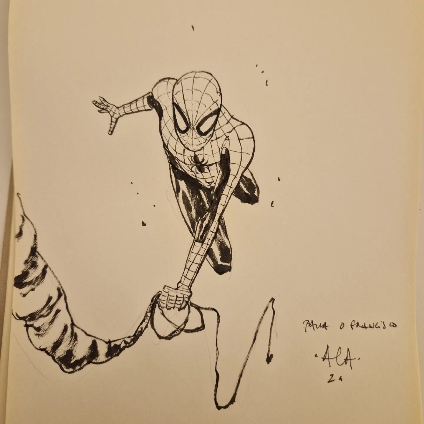
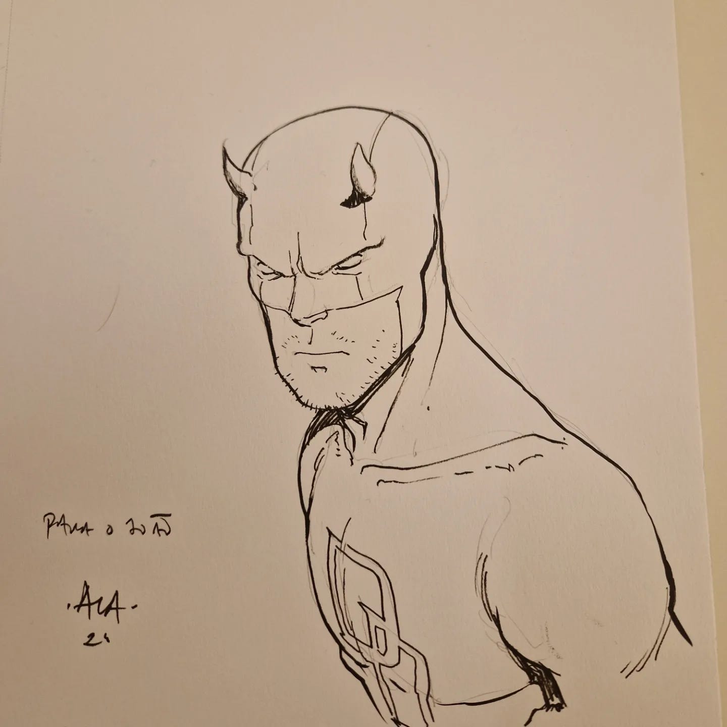
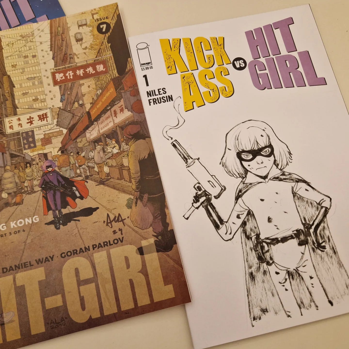
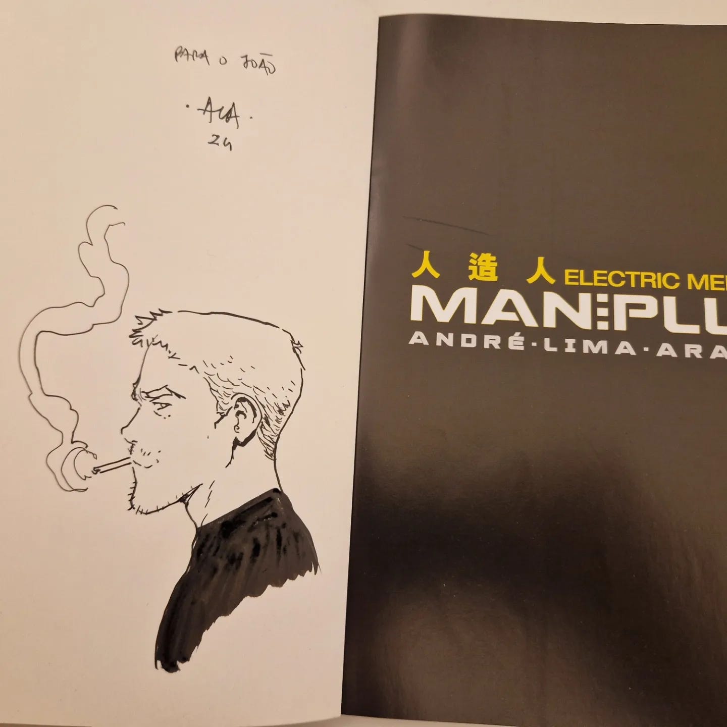
Last weekend I spent some time at a Portuguese comics festival called Coimbra BD, where I signed things spawning from my entire career. Stuff from Marvel, DC, Man Plus, Righteous Thirst and Phenomena. As usual, I did some sketching for the lovely readers who came to talk to me, with some coming out good enough to share:
—
I’ll see you next week!
André




Damn, you make it look easy. Awesome pages!
🔥🔥🔥🔥🔥🔥