Hello from Castrum Lusitania, my fortress in northern Portugal. Welcome to another edition of our weekly newsletter.
This week I wrapped another one of my issues for The Sacrificers, so it felt appropriate to deconstruct two very different (and non-spoilery) panels to get a better look at my process for this series.
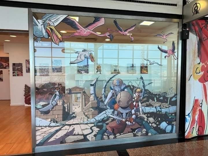
But before proceeding, a reminder that there won’t be a newsletter next week, as I’ll be present in an exhibition of my own work (plus two other very nice Portuguese artists - Joana Afonso and André Caetano)
The exhibition is in Viana do Castelo, a nearby city and it looks like this:
I’m looking forward to check it out myself and talk to everyone there. Expect more pics and details as I’ll be there on the 15th of June.
The Sacrificers step-by-step
As mentioned in the intro, my second issue (#11) for The Sacrificers is now completed. Finishing it was an intense affair, because I chose to work on the last 10 pages by doing various passes on all of them. First brush, then thicker lines, then details. It’s a good way to optimize things, but if it runs for too long you end up feeling like you never get anything finished. And these being laborious pages enhanced the feeling even more, which made me decide to work on smaller batches for the next issue. That will allow me to control production and pace a bit easier.
After that, I worked on the washes digitally, over the course of two days, before delivering all the files on Friday, finishing two weeks of rather vigorous dedication. So it feels appropriate to dive into two panels and see all the steps it takes to finish each drawing.
I chose two very different images: a close up and an establishing shot. Let’s start with the simpler one.
Panel 1
A close up of Forman, one of my favorite characters from this book. In the thumbnail, I did a frontal shot but pushed to the side, partial cropping it by the panel border. This was for two reasons: leave space for the balloon and add a bit of tension and menace to the shot. Not seeing something clearly or entirely helps adding anxiety and fear.
I pencil directly on top of the thumbnails since I begun penciling digitally, so this was fairly straightforward. For a symmetrical shot of something like the Forman’s mask, I use the mirror ruler on Clip Studio as it allows to keep the proportions. Basically, it mirrors to one side what you draw on the other. But I use it only to do the bare bones structure, then turn it off to continue drawing. That’s to avoid it feeling too mechanical.
The inking was, again, very straightforward. It was all about maintaining the composition tight.
Lastly, the grey washes were key for the uneasy feeling of the shot. Hence the choice to lit him from behind, making it menacing and a bit mysterious. The bottom line is transversal to all the steps, on every page: every choice is done with the story in mind.
Panel 2
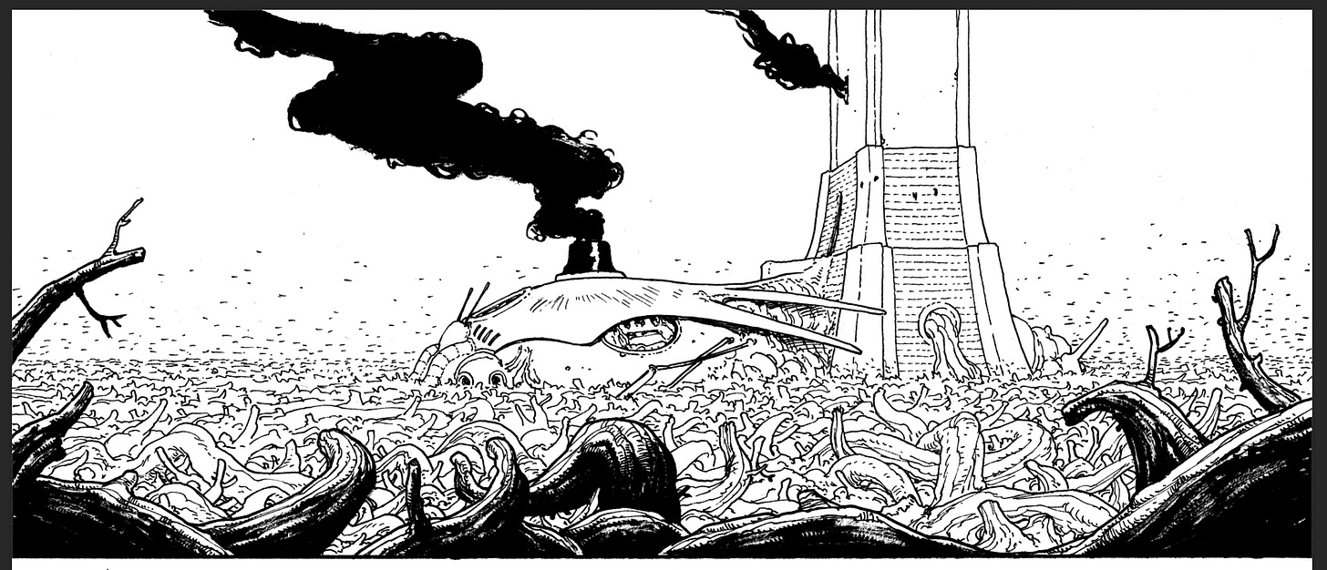
The second panel was an establishing shot of the Forman’s tower. Usually, you’ll want to go with a perfectly clear image so the reader can quickly wrap their heads around the location of the scene (exceptions being when the story demands otherwise).
I went with a full image of the building, cropping only the tower (for space reasons), and adding a bunch of dead branches on the foreground to help with the composition and the sense of immersion. I love getting something very close to the camera in the foreground to really put the reader in the scene, as if he’s behind those branches himself.
For pencils, I established a quick perspective grid to help with the depth of the image. I kept it simple though, as the organic nature of the building’s design meant you don’t need one to draw it. The main trick here is to keep the proportions from the previous issues.
I planned the inking of this shot to already be a major step into helping plane separation. So I used the brush to give weight to the branches on the foreground, but only lines to the ones immediately after and less and less detail the further we go. Around the building, they are already little more than abstract scratches, allowing us to focus on the important part. I decided to use black for smoke at this stage, to add to the ominous feeling of it all.
For the washes, I went with a dark, mostly flat grey for the foreground to further the plane separation, and some lighter strokes in the mid ground branches, to help a bit with volume. Same thing for the building itself, where like with the line work, I kept the grey washes to the building alone to highlight it from the rest of the background.
Despite struggling with how much work was to wrap it, this was an immensely satisfying chapter to work on. I also got to see Dave McCaig’s colors for issue 10 a few days ago, which leaves me even more excited to see 11 completed.
—
In the meanwhile, I’ve been advancing with a couple of non-comics projects, which always help to renew creativity and enthusiasm. The amount of people other mediums require to get something off the ground also reminds me that there’s no place like comics to get something straight from the creators’ head. It’s a direct line between reader and maker that doesn’t exist anywhere else.
Comics. Doesn’t get any better.
—
See you in two weeks!
André


Congrats on the exhibition André!
Hi Andrè
Is there a catalogue for your exhibition?
And how long is the exhibition on for as I will be in your neck of the woods in early October?
Loved the walkthrough and the images!