Hello from Castrum Lusitania, my fortress in northern Portugal. Welcome to another edition of our weekly newsletter.
It has been quite a week of hard work, I’ll tell you that. On top of working on Phenomena 3, I’ve been drawing a record number of covers this month, which meant that my attention had to be divided between things. Everything was made with the new process of digital pencils + traditional inks (Read more about it here and here).
And now that I have inked quite a bunch of pages and covers, let’s see what differences we have between inking digital pencils versus inking traditional pencils.
Digital Pencils vs Traditional Pencils
As I’ve written in the past couple of weeks, despite changing from traditional to digital pencils, I’ve kept the actual drawing process pretty much the same. I’m not using 3D models or anything of the sort, I only changed things to increase my working speed.
I’ve done that with the ease that comes with building much faster perspective grids and with drawing on top of my own thumbnails. Even so, there are a few differences that came naturally from the changing to digital that I’ve picked up:
1. Everything is much cleaner.
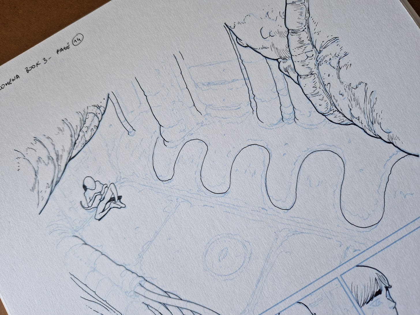
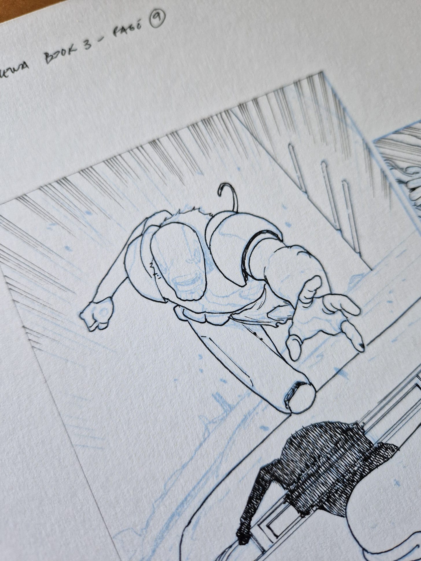
See the following half inked panel:
This an organic space, with everything drawn free hand. Nonetheless, it’s built with a 3 point perspective grid, BUT because it’s digital I can draw the grid in a different layer. Then I pencil the stuff you see above in a separate layer, erase the grid and print just the stuff that matters. This takes away lots of unneeded lines and makes inking easier.
I will say that in some panels (that we’ll see in the future) I kept the grid, because it can be a very useful reference if you leave a lot of drawing to be done in ink (which I do). But in those cases I can simply turn down the opacity of the grid layer so it prints much lighter than the rest, simplifying the overall look in the end.
2. I’ve been drawing slightly smaller
This was not intentional, though I was aware of it as a lot of digital artists mention this tendency. Because you can zoom in quite a lot, you can lose track of the scale of the page and end up drawing things that are simply to small to see in the final book - or in my case, too small to ink.
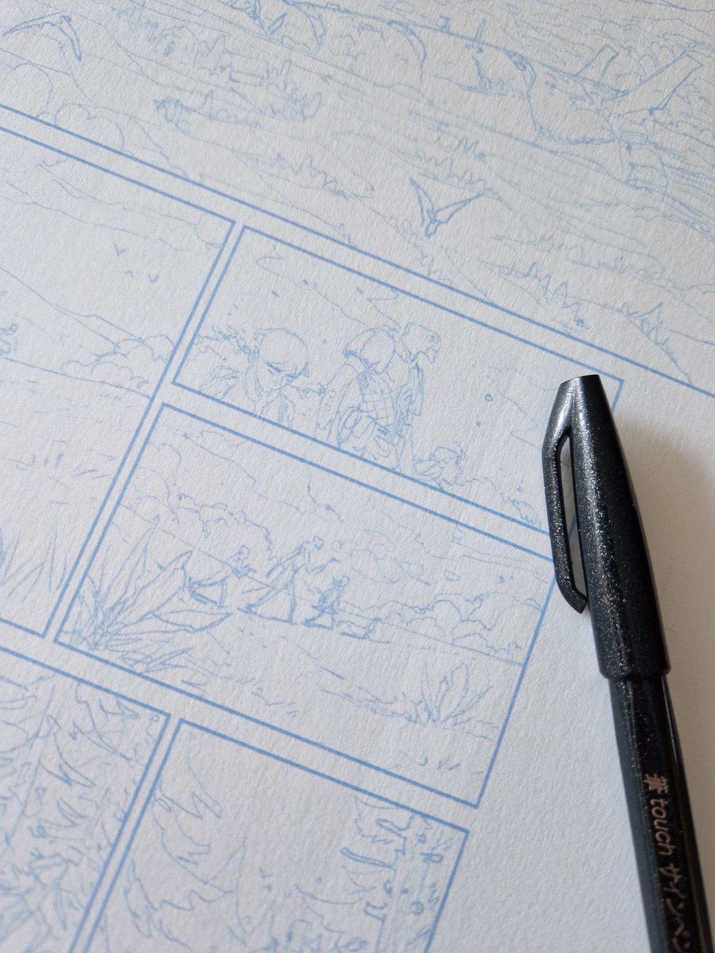
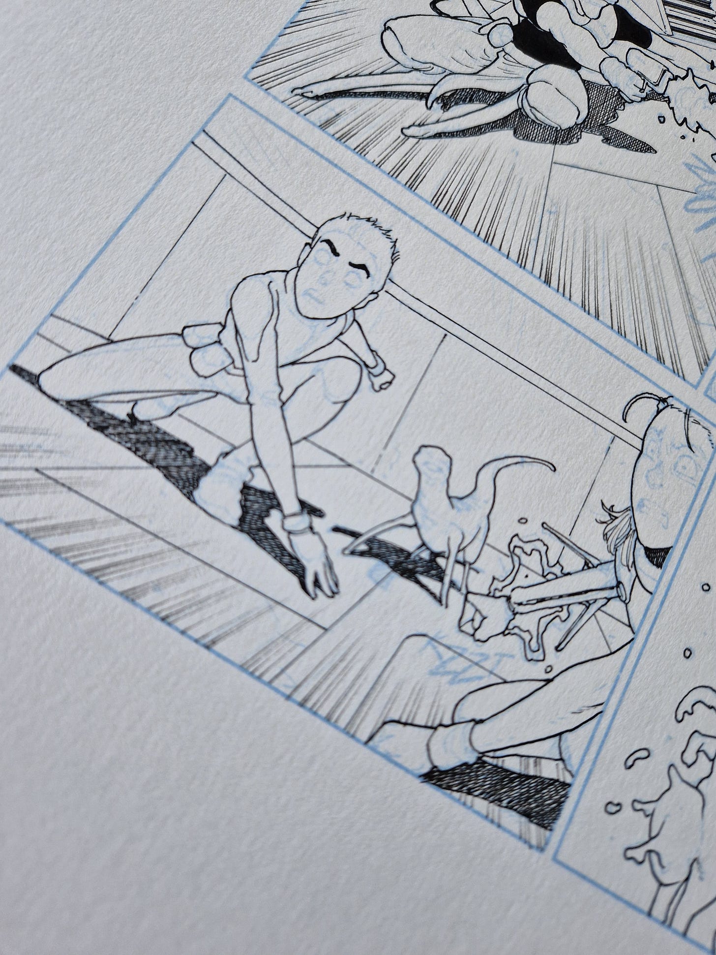
Since I knew about it, I kept my pencil size always the same. That way, if I zoom in too much it doesn’t work, because the pencil simply isn’t thin enough to draw details after a certain point. Still, I noticed that some panels are a bit smaller than usual when comparing to traditional pencils. Only a bit, like a 10% reduction, but it’s there. This panel (where the pen cap is) is a good example:
All of it is visible and “inkable”, so it works well. It’s something I’d be perfectly able to draw traditionally, but the instinct would likely be to zoom in a bit and draw bigger faces. In any case, the locked pencil size was a good trick otherwise this could get out of control.
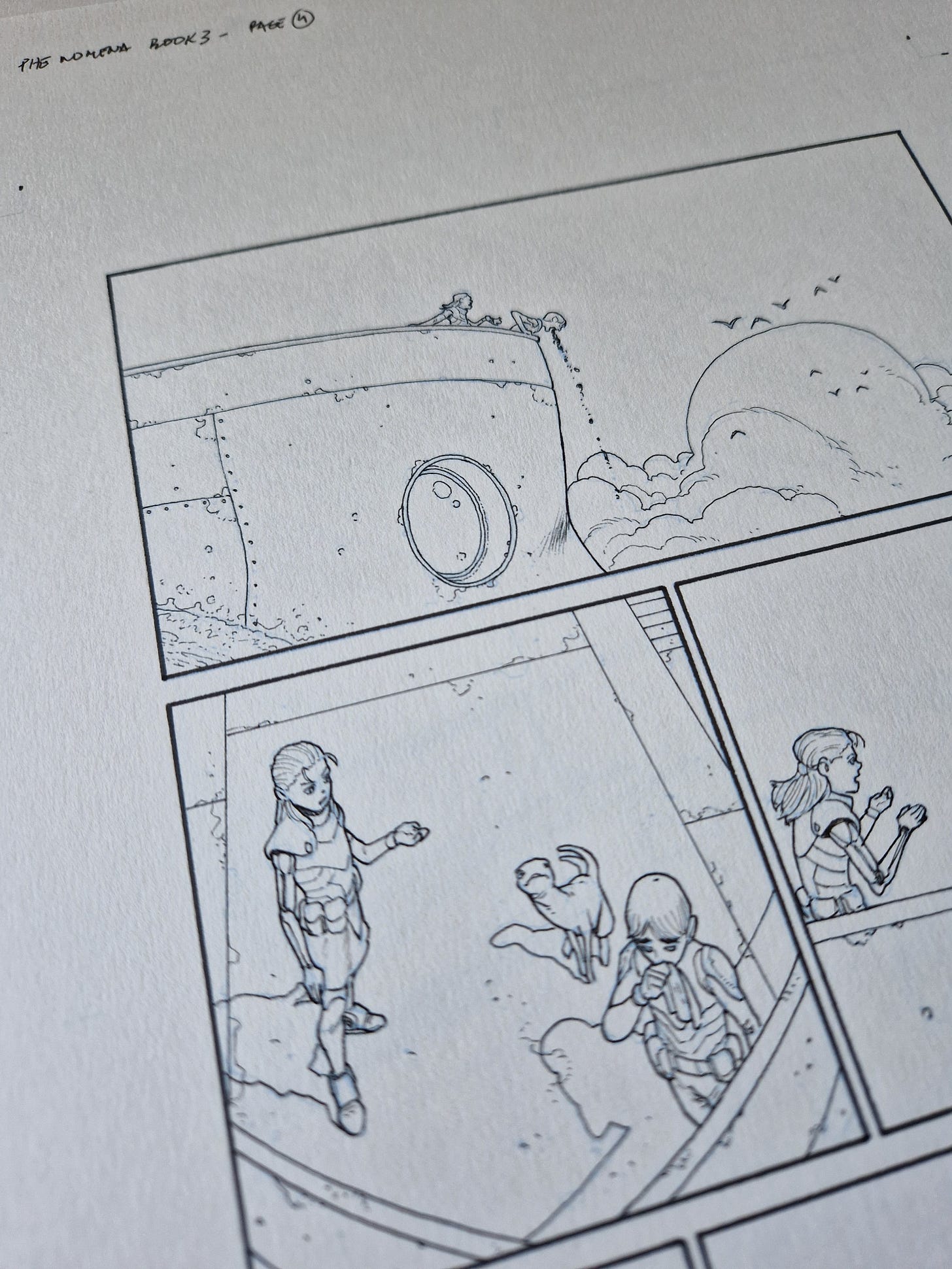
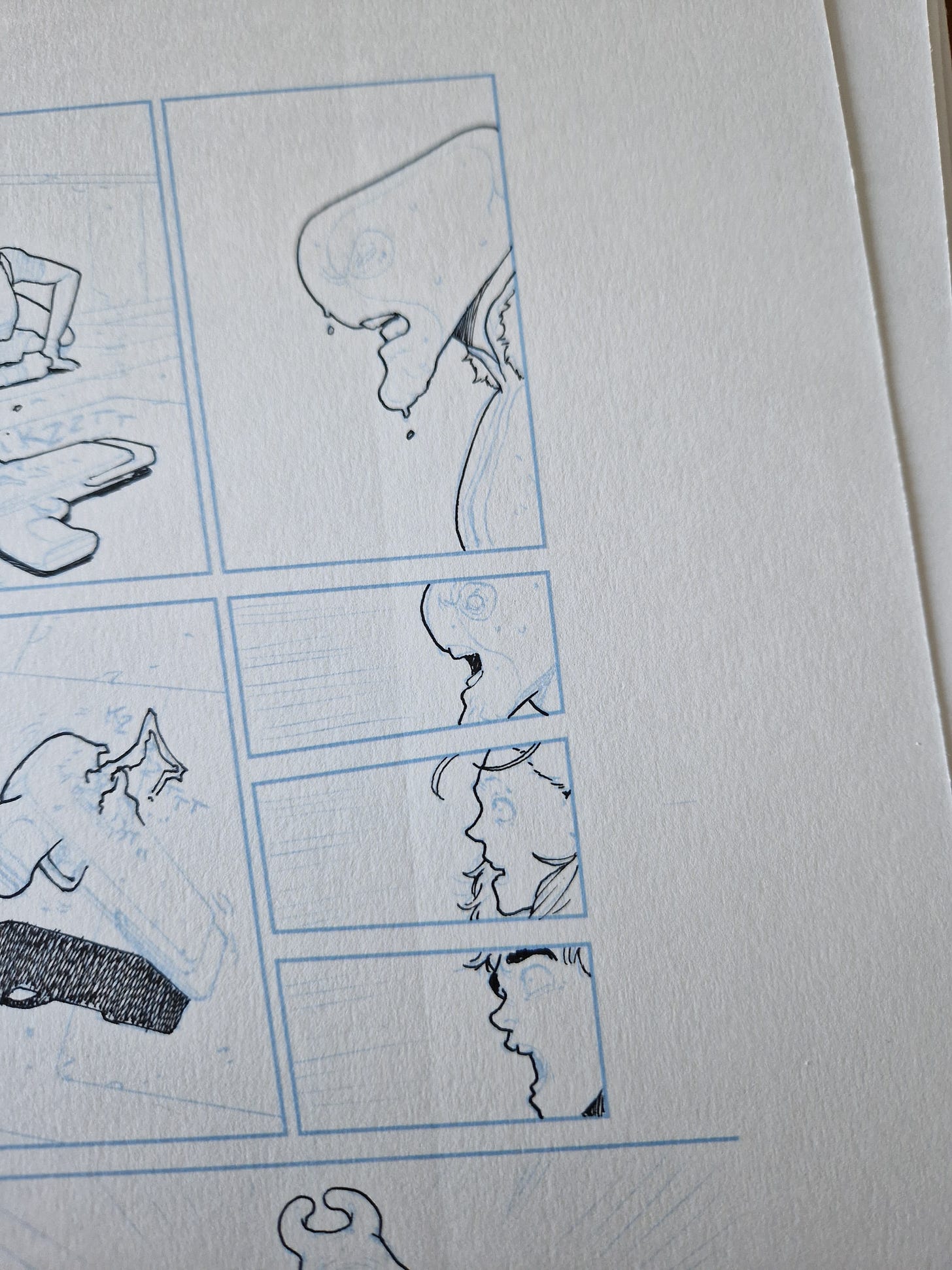
And now, some work-in-progress shots of the pages on my desk. I kept the inking process the same: first I do the thick lines, then everything with a ruler (including speed lines) and finally I go with the thinner nib and add all the details. (First image is fully inked.)
Covers
I can’t show any at the moment, but I’ve been working on 3 covers this month (and just yesterday accepted another one - for September - for an incredible book that is hitting the shelves right now). Of the three, two are finished and the last one is penciled, printed and ready to be inked next week. They are all very different and for great books and I look forward to show the steps here. Particularly the wonderful colors my good friend Chris O’Halloran is laying on them.
I’ll leave you with a taste of what’s been cooking. I love laying some bricks:
I’ll see you next week!
André



I’ll have my magnifying glass ready!
Looking forward to seeing those covers! Chris does great work with your illustrations, but do you ever get the itch to color your own stuff?