Phenomena Book 3 proofs
What a beauty!
Hello from Castrum Lusitania, my fortress in northern Portugal. Welcome to another edition of our weekly newsletter.
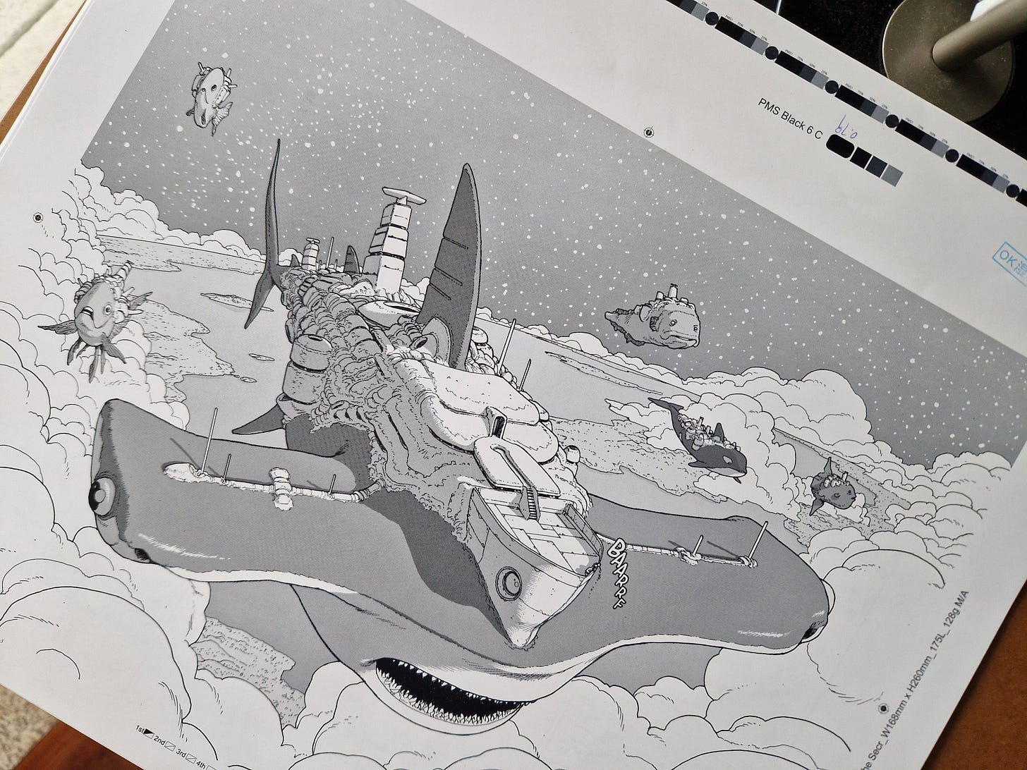
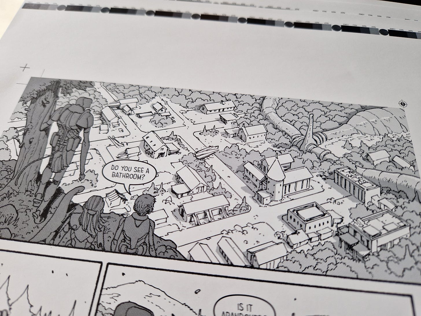
I recently got the proofs for Phenomena Book 3 and I can’t resist to give you a little peek. They came out perfect in all of its screen tone glory which is always a huge relief. You might think that with the third volume it should all be smooth as butter, but we had a bit of a scare at first - more on that below!
Because first, an update on…
Project Red
“Wait, Project Red? What is that?”
That is my new book with Rick Remender. And I thought I should come up with a name for it, because it’s gonna be a long time until it is announced and it would be impractical to keep referring to it without a name. Saying “my upcoming book with Rick Remender” over and over again over the next few months is not ideal, so Project Red is now a thing. My newsletter, my rules.
Why Project Red? It’s something abstract, without meaning in relation to the book. It’s just some good old color coding. Easy to refer to and throw around.
So, the update: there’s no turning back now.
I’ve inked and colored a large character sheet and I’ve completed (from pencils to grey tones) the first 8 pages. That on top of numerous sketches, studies, ideas, large text documents and bits of script that we already have. I’ve also spent a good chunk of yesterday’s afternoon experimenting and tweaking settings on watercolor brushes on Clip Studio until I found the perfect one to carry me through the book. And me and Rick have frequent zoom talks and emails about plot, storytelling, design etc.
It’s moving fast and I’m unreasonably excited.
Phenomena Book 3 proofs
For those unaware, whenever a book goes to print you get proofs of selected pages to see how it’s looking and sort out any existing problems before committing to printing the entire run.
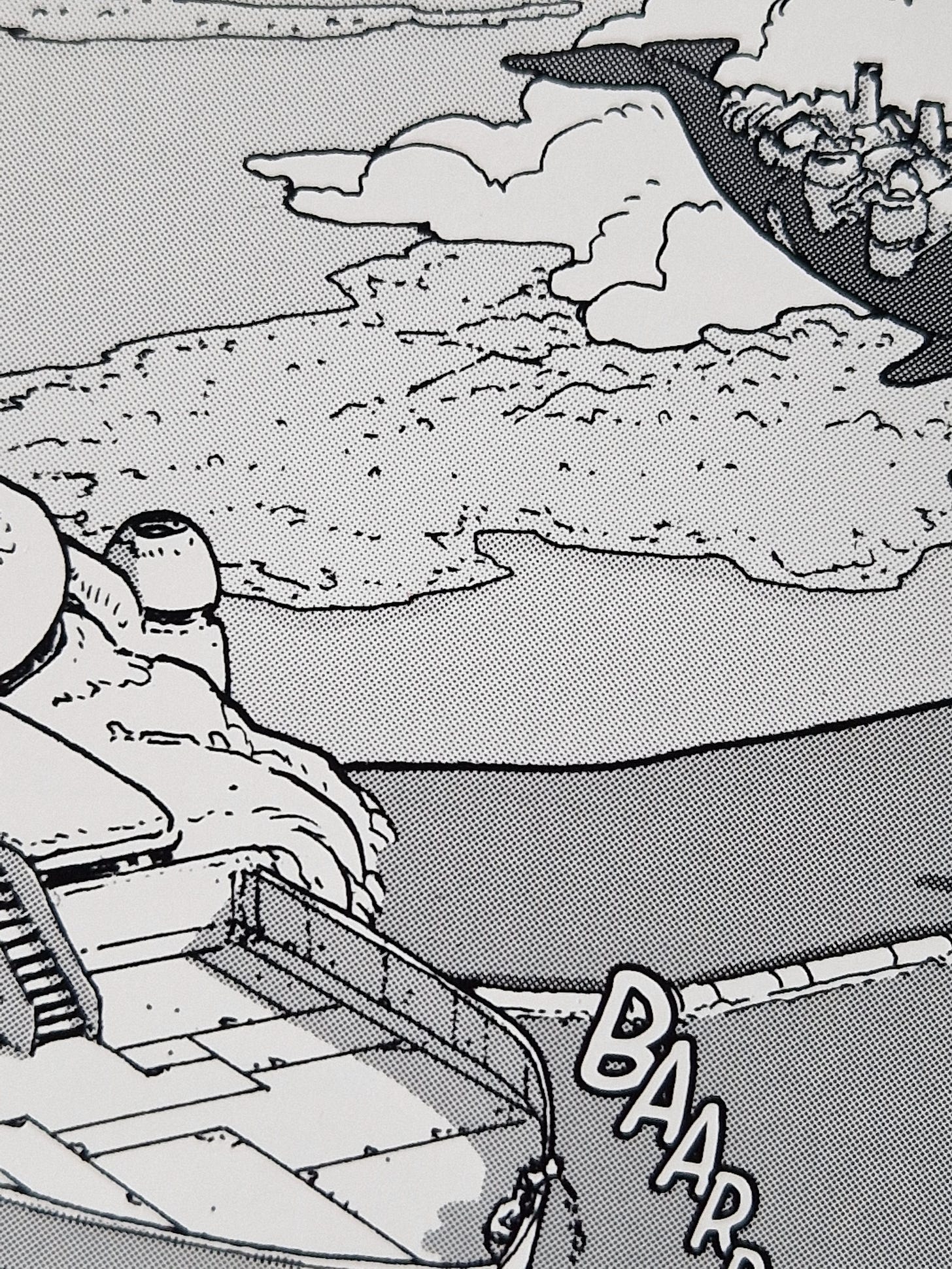
Well, thank God for that, because Phenomena Book 1 came out horrible in the first batch of proofs. There was a ghastly moiré effect all over it and it took a bunch of attempts to fix it. Knowing what the trouble was, we went into Book 2 with the solution in hand and it came out lovely right out of the gate. But, lo and behold, some moiré popped up on Book 3 again. After a few hours of intense panicking (HOW CAN THIS BE HAPPENING?! etc) we learned that due to a small mistake it was being printed at 99% of its size - enough to cause the screen tones to have the moiré.
Promptly corrected, they sent us a batch of properly sized proofs and voilà, perfection!
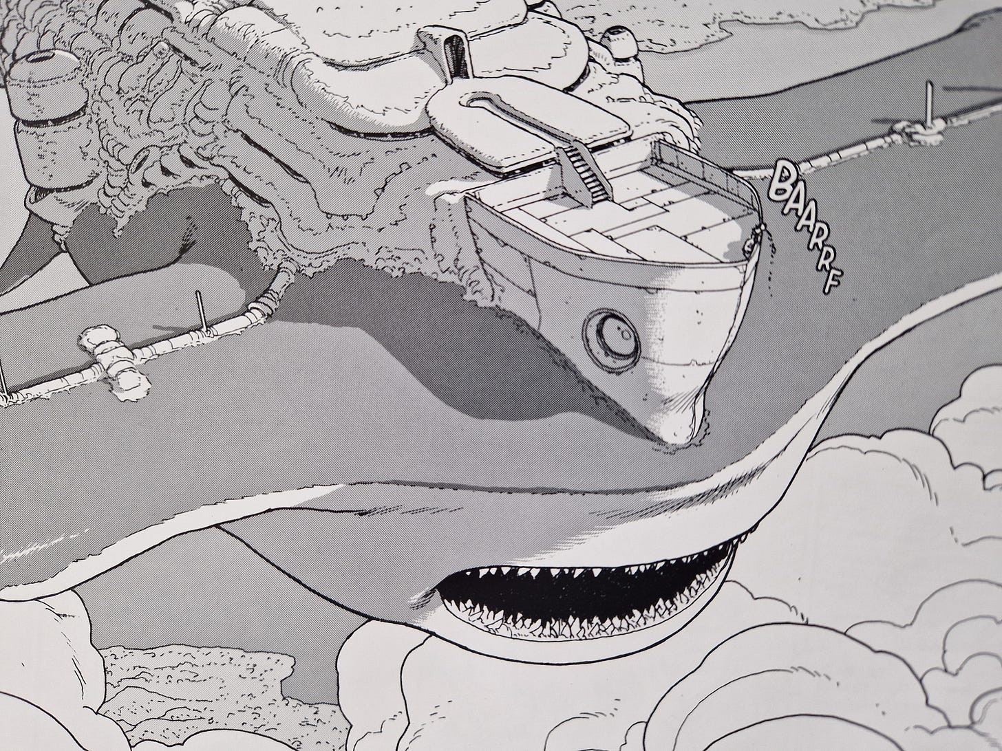
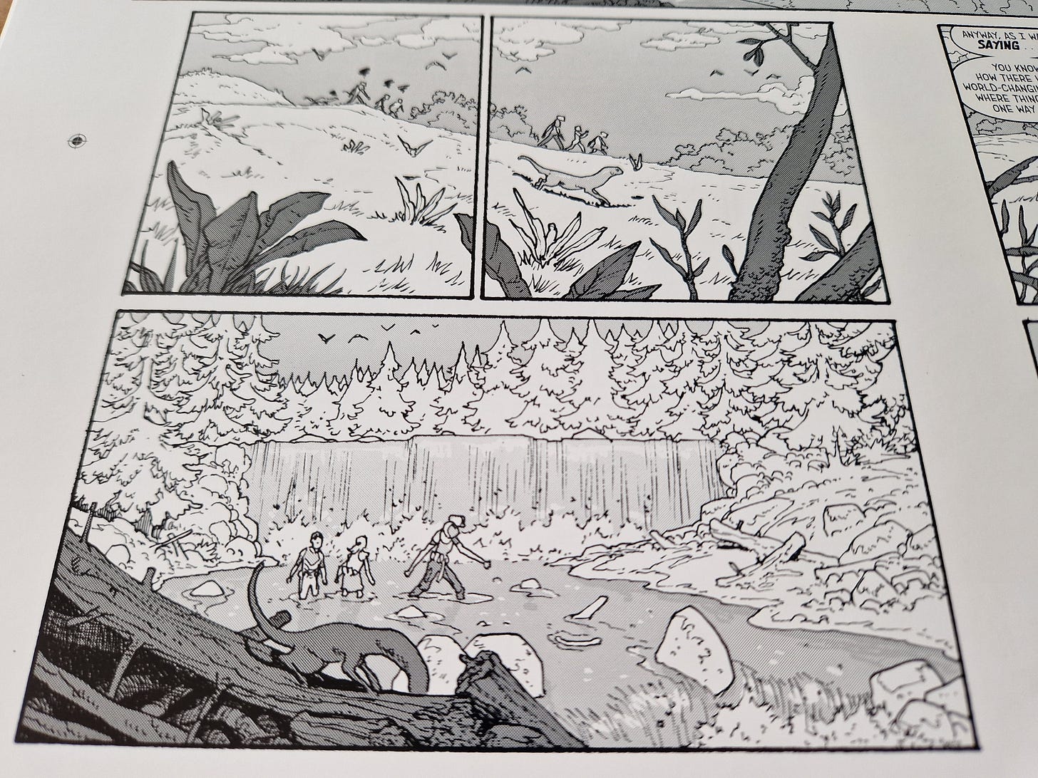
All the tiny dots perfectly in position, with their different sizes and distancing creating those lovely grey tones. So much so that I can’t resist to show you the first spread and a some of its details:
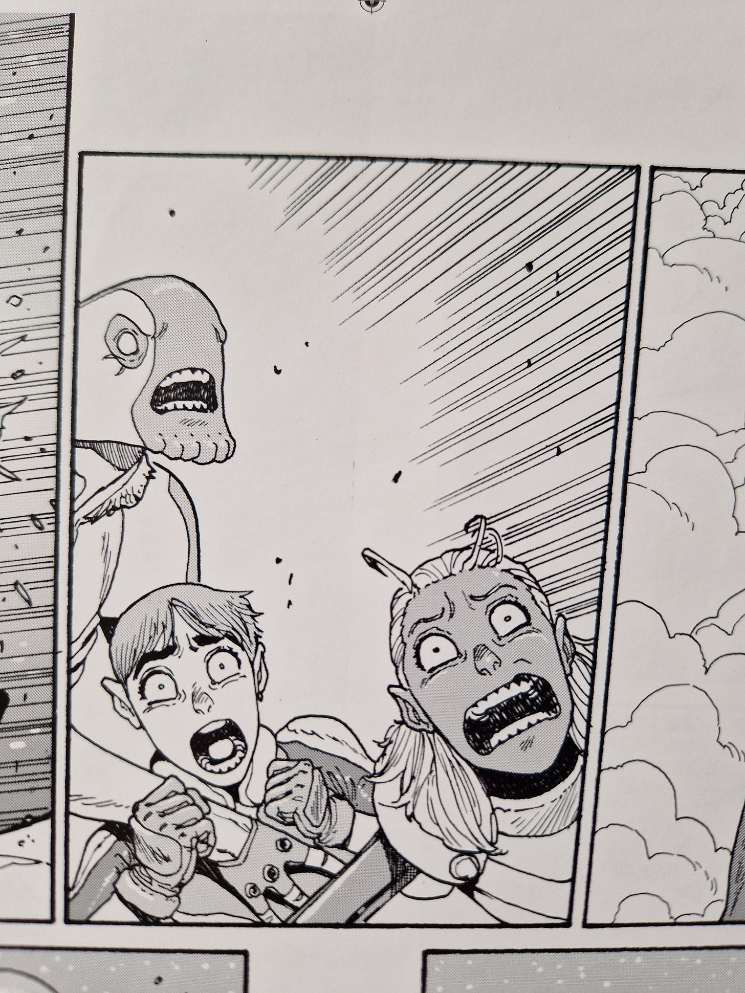
Also a few extra panels:
Chef’s kiss.
A REMINDER: Phenomena Book 3 is up for preorders!
Read more about it and its cover here.
Reading Pile
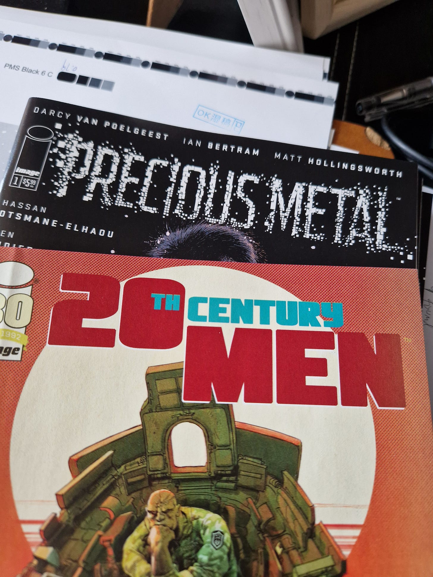
I’ve recently subscribed a few comics from a nearby (kinda not really) comic store, so I have a very interesting reading pile of new and contemporary stuff to tackle in the upcoming weeks, for a change. I’m particularly keen on starting these two:
Little Bird is one of the finest comics I’ve read in the past decade, so to see the creative team returning to its universe is terrifyingly exciting. And I heard nothing but great things about 20th Century Men. Very much looking forward to it.
John Cassaday
A sadder but absolutely needed note on the passing of John Cassaday, a giant among storytellers. Over the last couple of weeks, the greatest things were said about him by the greatest people. There isn’t much I can add to his superlative work, but his old partner in crime Warren Ellis wrote a fine piece about John, which everyone should read: https://orbitaloperations.beehiiv.com/p/john-cassaday
Rest in peace, John.
—
See you next week,
André


STOKED!
AGH that panel on the hammerhead is beautiful! That’s the kind of shot that makes me want to live in a story