Hello from Castrum Lusitania, my fortress in northern Portugal. Welcome to another edition of our weekly newsletter.
In the last newsletter I wrote how I’m working on a fairly large number of things at the same time, most of which I can share very little of - such is the nature of the job. So, instead of glimpses of various things, this time I thought it would be interesting to give you a step by step of how I do my digital screen tones for Phenomena. The technical process itself is fairly simple and easy to follow/replicate if you have any interest in trying it out.
Digital screen tones
For my digital screen tones I use flat grey tones for the most part that I then convert into a dotted pattern. This means that instead of the flat shade of grey you get an image comprised of small dots, which size and density varies and creates the shade you want. You can define how much resolution you want to apply in it, basically defines the size and spacing between dots required to create a certain shad of grey using more or less dots.
We don’t need to go very deep here into why I use these types of tones and not others (I could use any type of brush or effects after all), but the simple answer is because I always loved the simplicity of the old school Japanese comics which mastered the use of these tones and I wanted to emulate it on this book. Also, lots of effects and textures tend to conflict with a detailed art style (which is my case), so even in color I prefer a flatter approach (see Righteous Thirst For Vengeance, for example).
Step by step
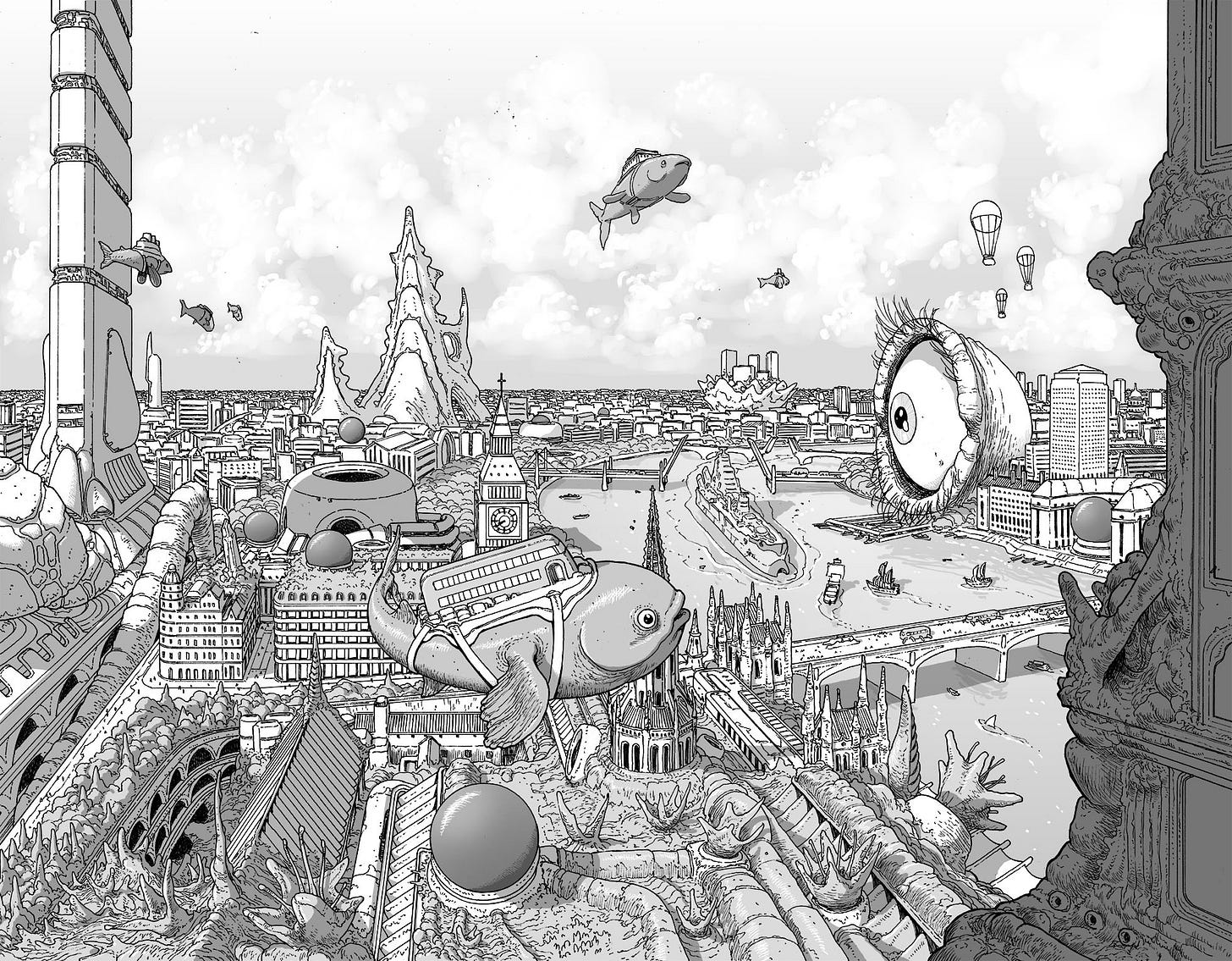
Let’s take a detailed look at a step by step then. We’ll use a spread for Phenomena Book 2 that you’ve already seen before. This spread is one of the most complex in the book so it contains all the techniques I use. For other pages, I’ll use some of these steps, but not all. After reading this, you’ll easily spot which are used in any given Phenomena page.
Once all the inking is done, I scan all the pages and adjust the lines until I have nothing but black lines isolated on a layer with a simple white background below (this process might be worthy of a newsletter of its own). Then I pass the file to the iPad and open it on Clip Studio Pain.
This is what I begin with for tones (all lines are isolated in a layer):
The next step is simple: Following what I decided in my thumbnails, I start filling the bits that I want to fill with different shades of flat grey, placing them in a layer under the lines layer. The shades of grey are defined previously (to make sure I keep things consistent through the book) and there’s only a handful of them to make sure they are easy to differentiate - after all, their primary function is to aid the reading of the page.
Except those dark spheres, everything is absolutely flat. As you can see, certain things start to pop more easily, like the tower in the foreground or the big flying fish in the middle. It’s all about hierarchy and composition to clarify the image - something already present in the various line weights I generate while inking, but elevated with this step.
You’ll notice some highlights in certain places, like the flying fish, the spheres or the organic matter in the bottom of the image. These serve to further develop the volume of each individual element of the drawing (the last two images show a detailed explanation of this bit).
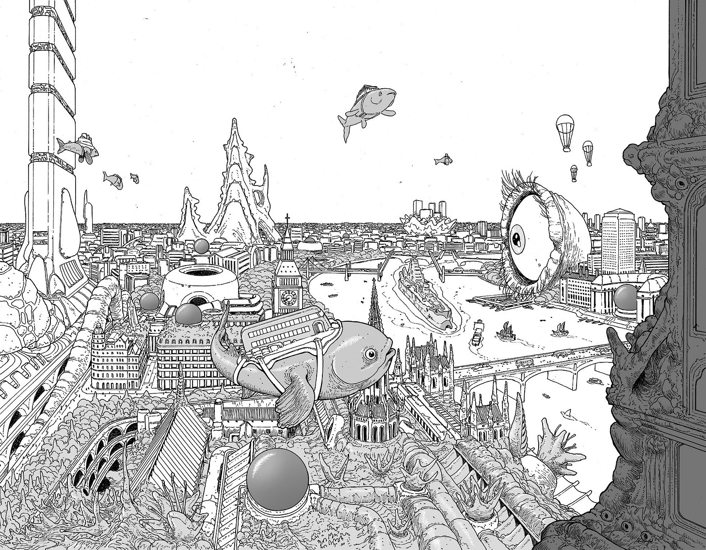
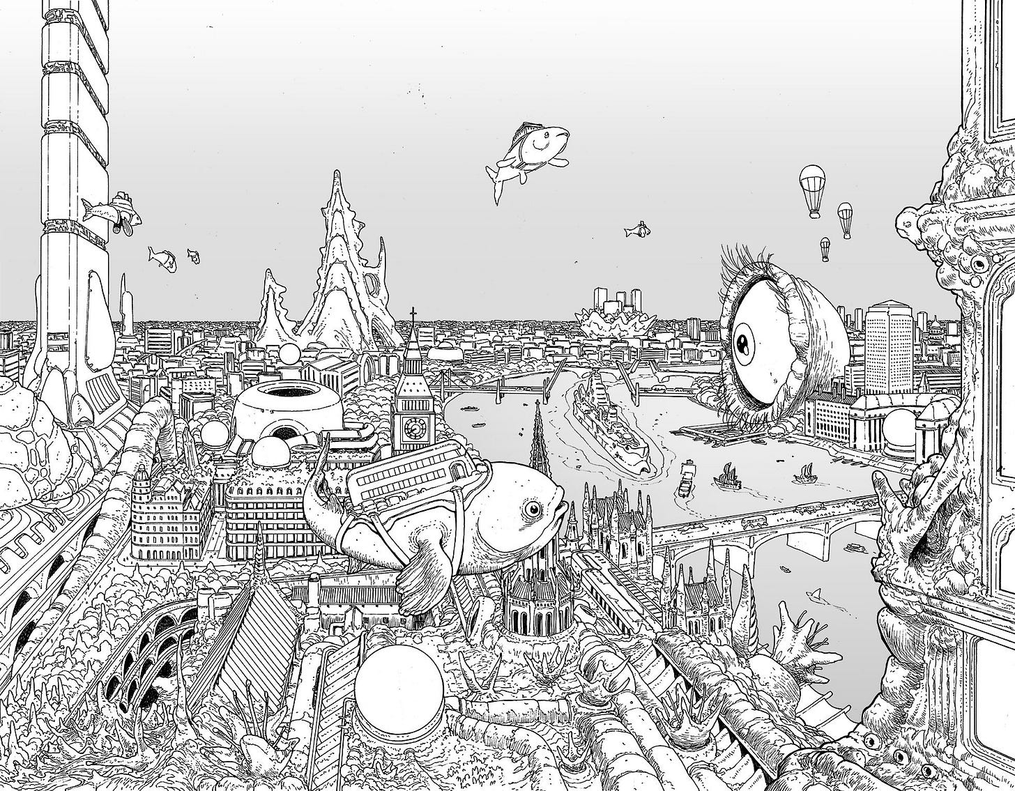
Next comes the sky and the river, which I fill with a flat tone on a separate layer. I always use the same base tone for sky and rivers/oceans, since the latter reflects the first. I then select it and use some gradients to help with the overall feeling and differentiate these surfaces from the rest. I isolated this step on the image below:
Over the water I add a layer with very low opacity and using black I draw some hints of reflections. This makes water seem more like water and establishes a better sense of proximity between it and buildings, bridges or boats directly over it:
To complete these two elements, I have another layer with clouds and some glowing bits over the water. Both are drawn with white. The clouds are the only element drawn with a different brush (and also worthy of its own post):
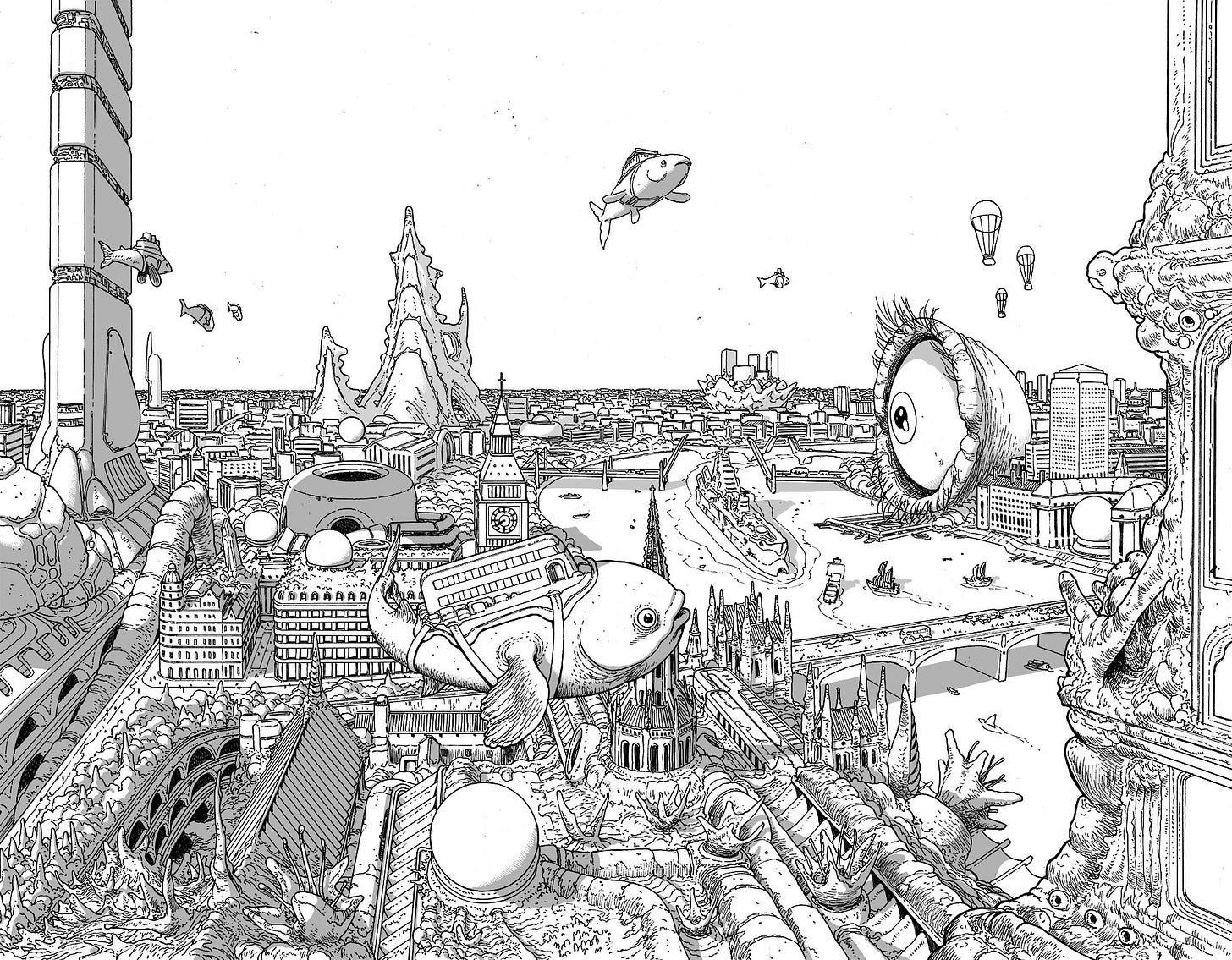
Finally, since this is a big spread with many elements, I add a layer with shadows. This makes wonders for creating depth and further shape the three dimensionality of the overall image, something that for me is key in an image like this. I draw with a lot of detail but at the same time I want the reader to clearly get the image immediately. All these steps are created with that in mind.
For clarity, below you can see the layer isolated. Most of this is not grey, it’s black with low opacity. That’s because it’s placed over all the other layers and this way works in all cases, wether the object it’s covering has grey tones or not. But the further the objects are, the lighter the shadow is to mimic the effects of the atmosphere (the density of the atmosphere erases contrast in distant objects), so I use lighter shades for those, all in the same layer. I start with black for things like the fish and everything up until the eye and the tall building in the left. Then is a grey tone. The layer opacity varies, depending on how much contrast I want. In this case, it’s all the way down to 30%:
With all layers visible, the image looks like this:
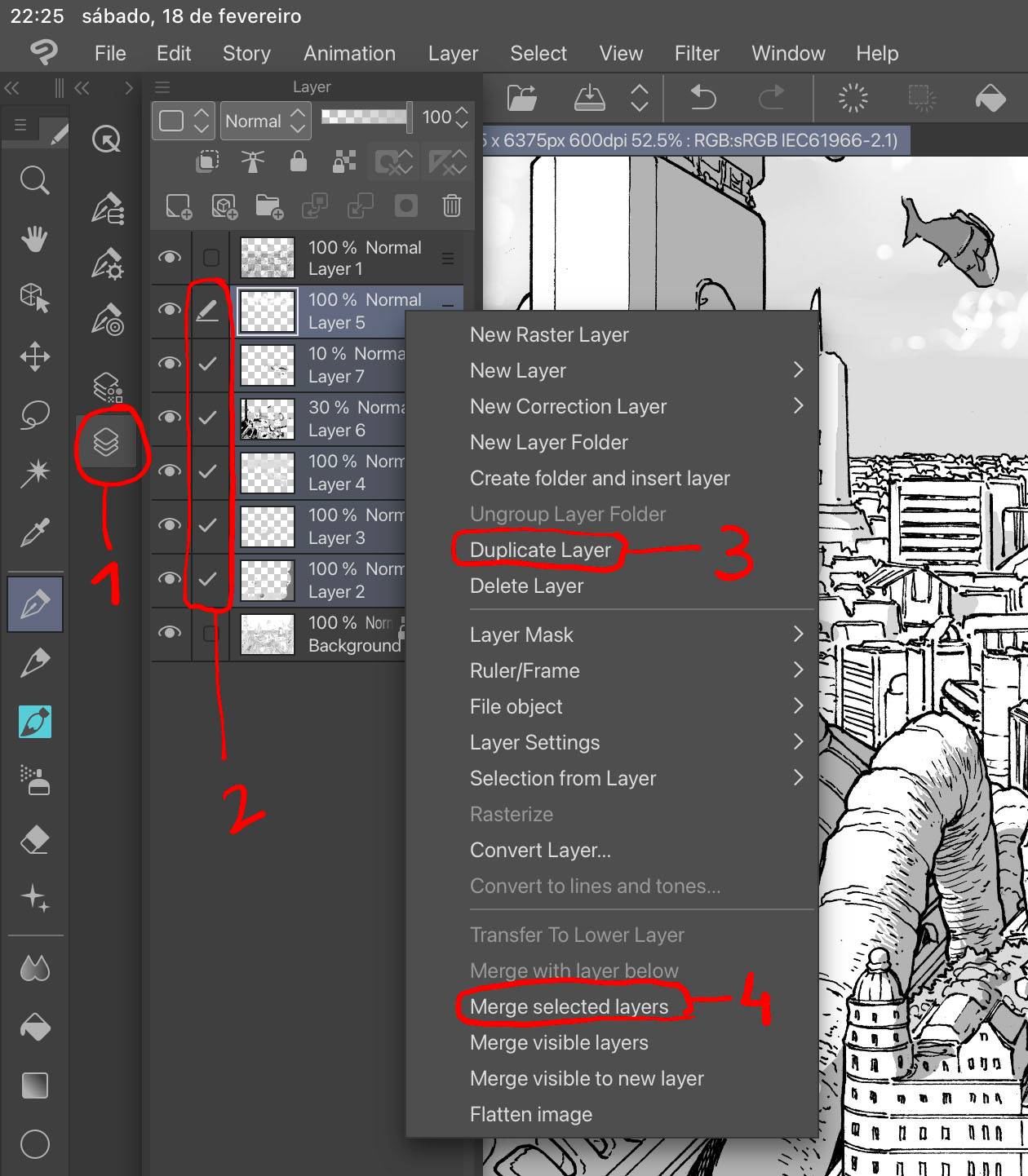
All that is left to do is transform the flat tones into screen tones. Below you can find the steps on Clip Studio Pro. First, I open the layers (1), select all of them except the line and the base layer (2) and click on duplicate layer (3). I do this so I can keep the flats in case I want to change/correct something later on. Finally, I merge all the duplicated layers (4) to more easily manipulate it in the final step.
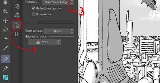
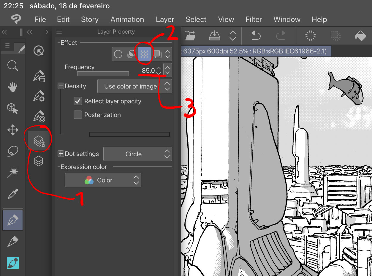
Making sure I’m in the duplicated merged layer, I select Layer Property (1), click on the dots option (2) and move the frequency to its maximum of 85 (3). You can play with more options (that you can see below), but I leave it like this.
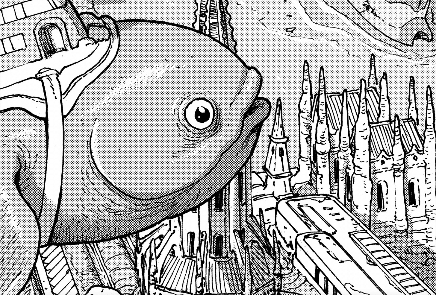
Here’s a zoomed crop of the image to really show what the difference is between a flat tone and screen tone:
You can also see the highlights more clearly. These are not drawn in white over the grey tones, it’s erased instead. The end result is basically the same, but my logic comes from the way you produce these highlights with actual screen tones on paper - scratching them with a sharp blade.
—
I hope you enjoyed this step by step. I know it gets a bit technical but I enjoy breaking it down for people and I know artists are always interested in the process of other artists. Feel free to ask any questions if something is not clear.
Until next week!
André







This is FANTASTIC. You don’t know how long I’ve searched for a smart detailed explanation of the digital screen tone process! THANK YOU!