Hello from Castrum Lusitania, my fortress in northern Portugal. Welcome to another edition of our weekly newsletter.
Before anything, the release of Phenomena Book 2 originated a media tour for me and Brian that seems to be finally calming down, but I still did a very satisfying interview with Comic Book Herald a week ago, this time going solo:
Now regarding this newsletter’s title: last week we had a juicy first look into my work on The Sacrificers. Apart from pages, it also included the covers for issues 11 and 12, for which I promised a dedicated edition with a breakdown/step-by-step and that’s exactly what we’re gonna get here.
They’re rather different images, one fairly simple and the other with my usual detailed backgrounds, so it’s quite fitting to have them side by side here.
Cover #10
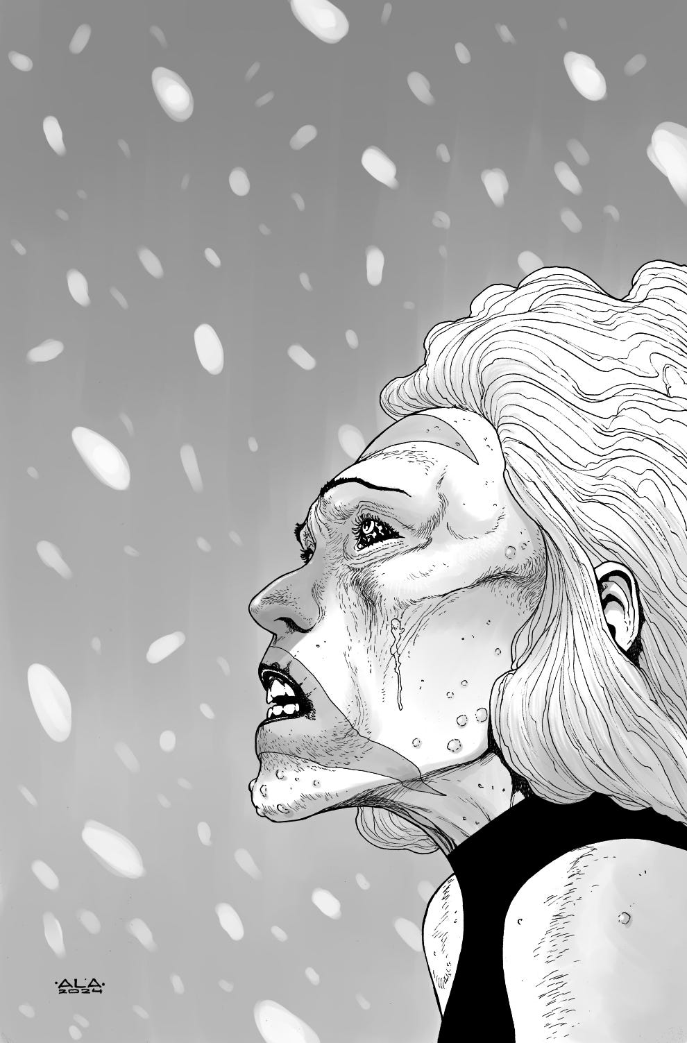
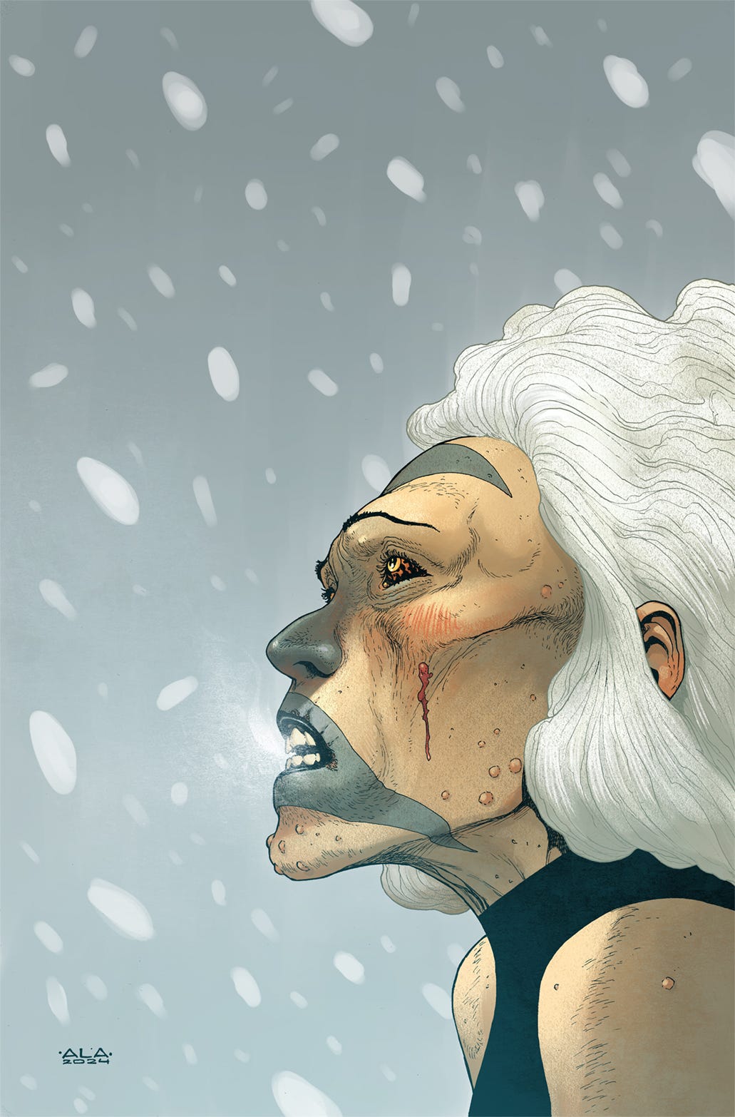
Cover for issue 10 was the first thing I did post-Phenomena and it was created on emergency mode. It had slipped through the cracks of the intense monthly book schedule and we had only a couple of days to get it done. For that reason, Rick suggested a close up of Soluna with a very simple background.
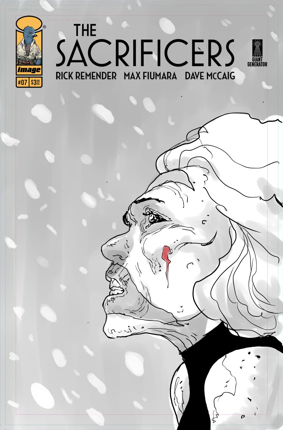
With that in mind, I came up with the following concept. I added snow falling around her to add some movement and populate the background (I didn’t want to not have one at all) while making sure it would be quick to do.
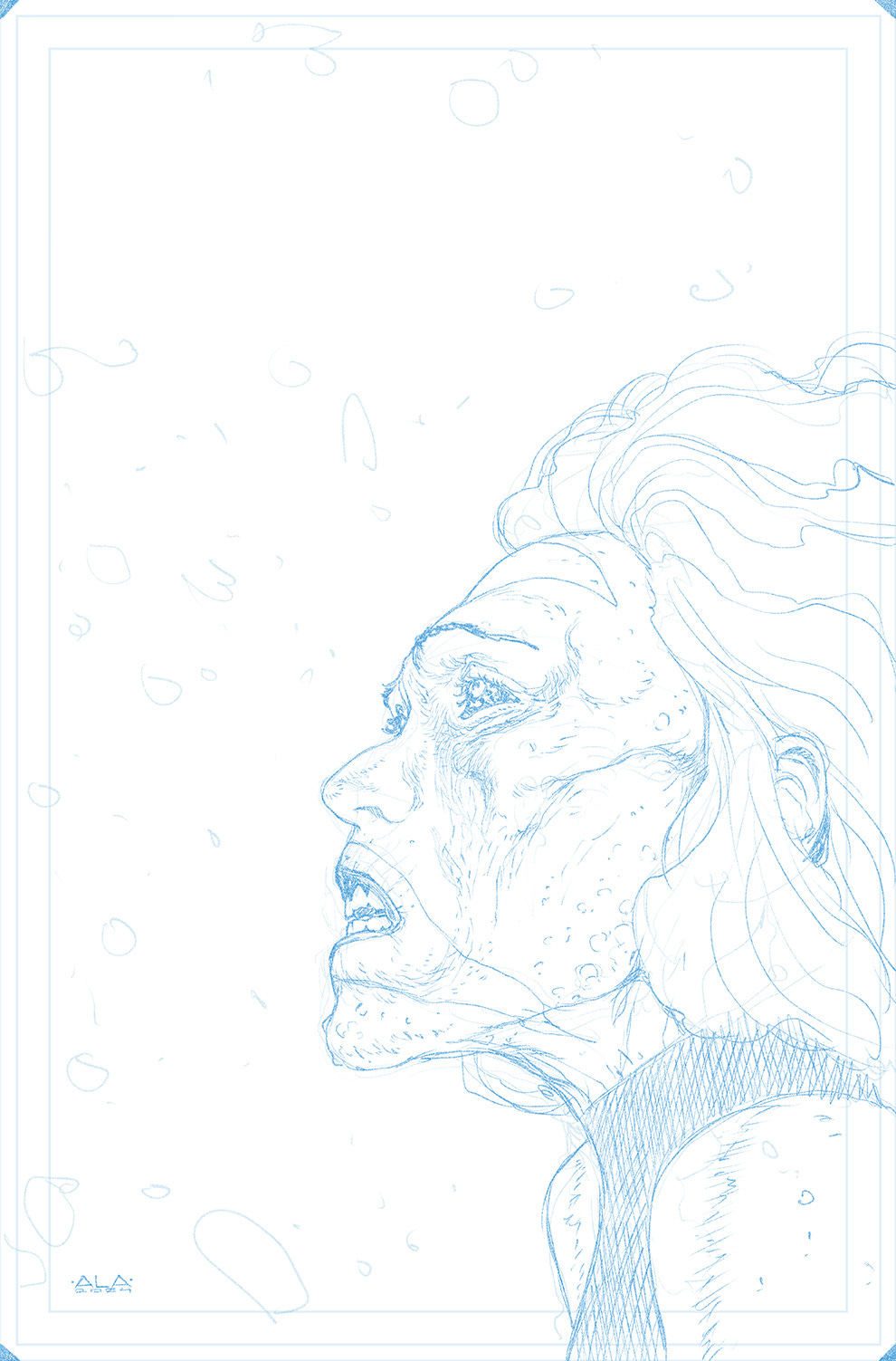
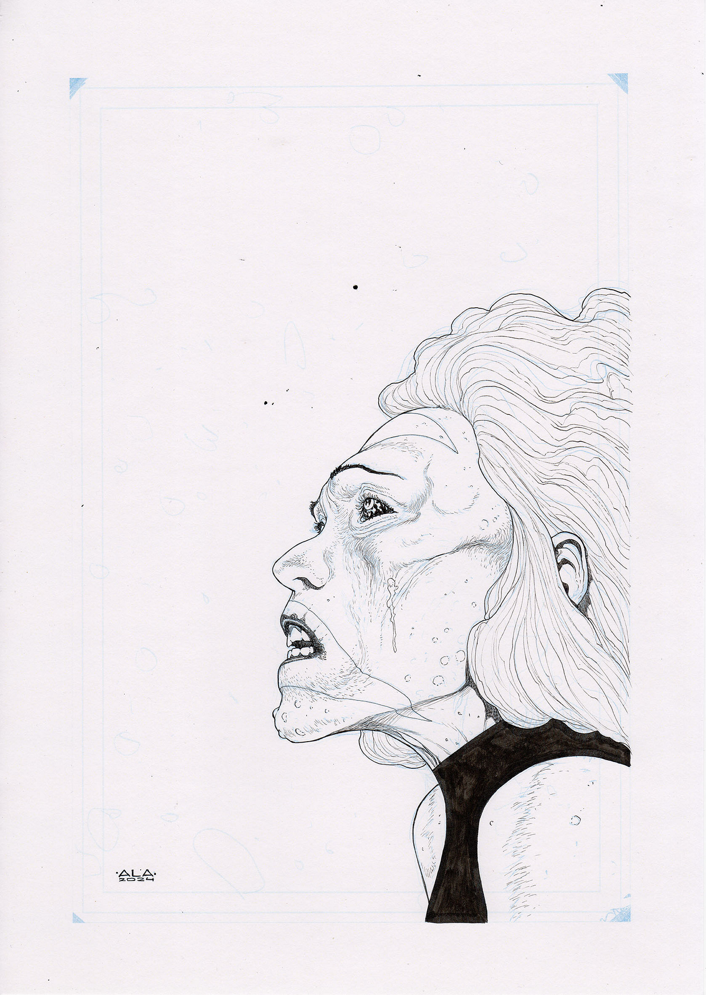
I rather liked how the digital brush worked to do the snow flakes when I was doing the thumbnail, so I decided to keep the technique for the final piece. Even though I roughed them out in pencils, I left it all open when inking it, completing the composition in the grey washes digital stage.
After creating a sort of gradient with the watercolor brush for the background, I added the white dots on a new layer with the same brush. Series colorist Dave McCaig did his magic and we managed to have it wrapped in 3 days between all of us.
Cover #11
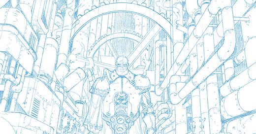
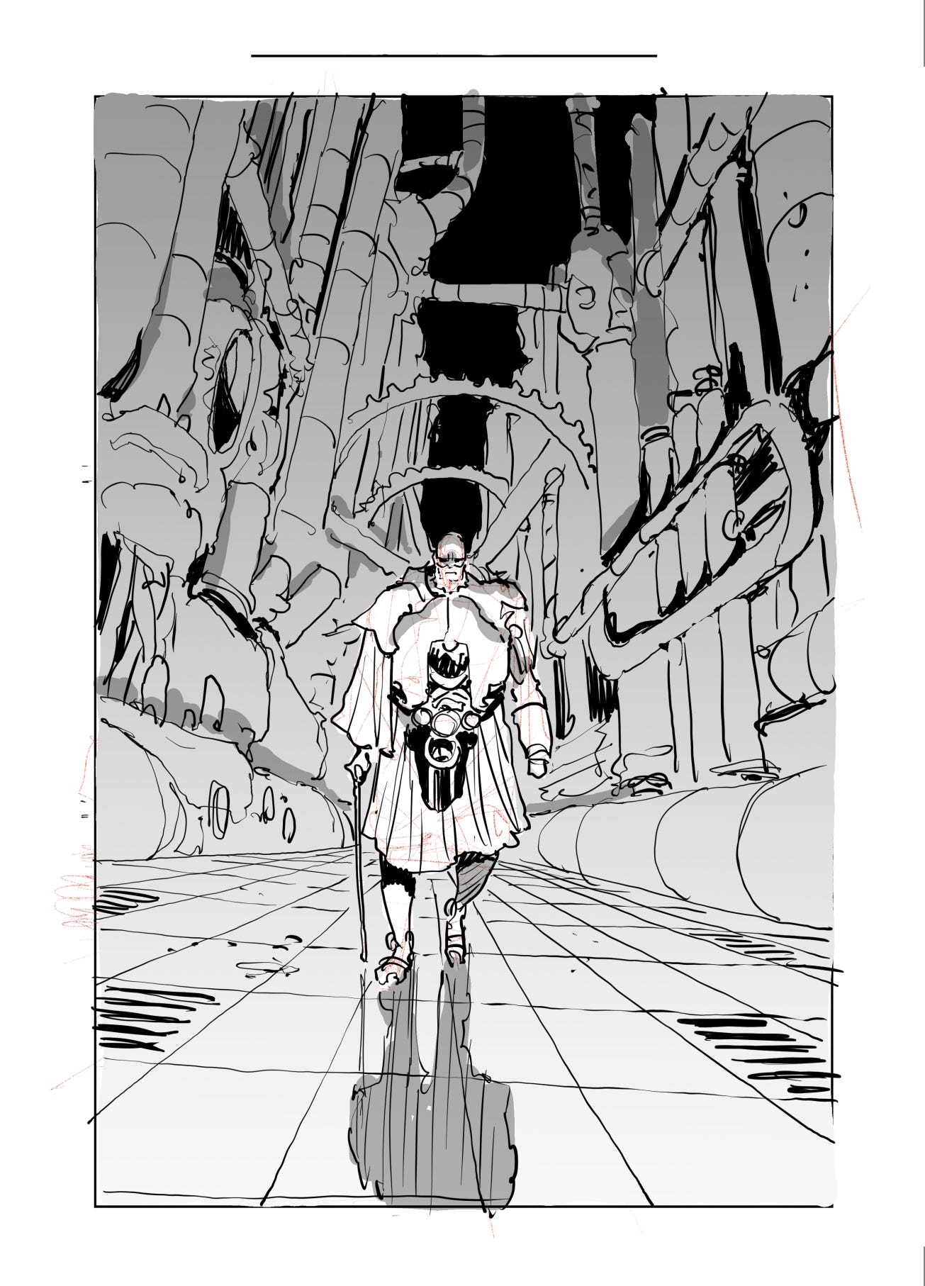
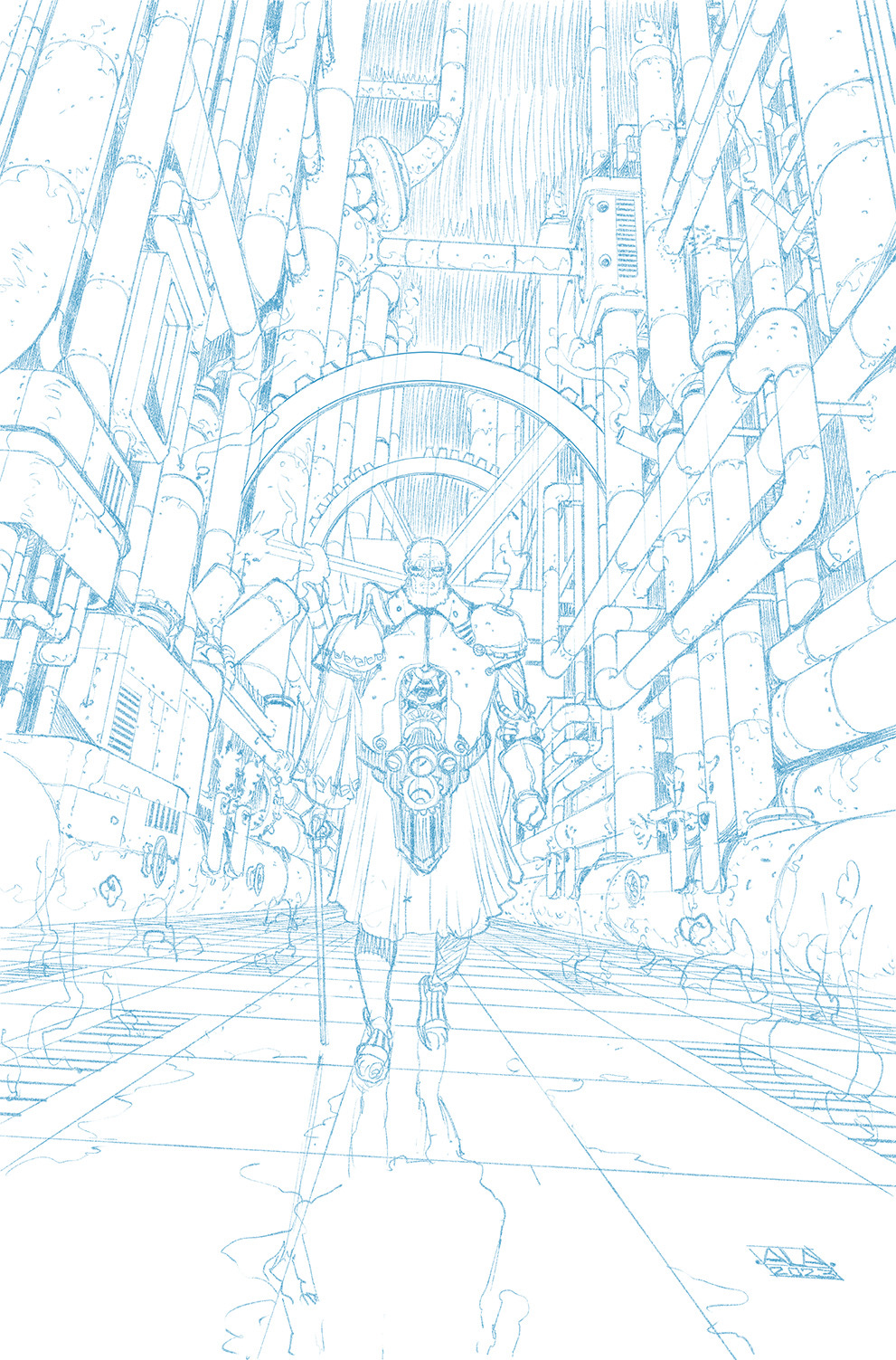
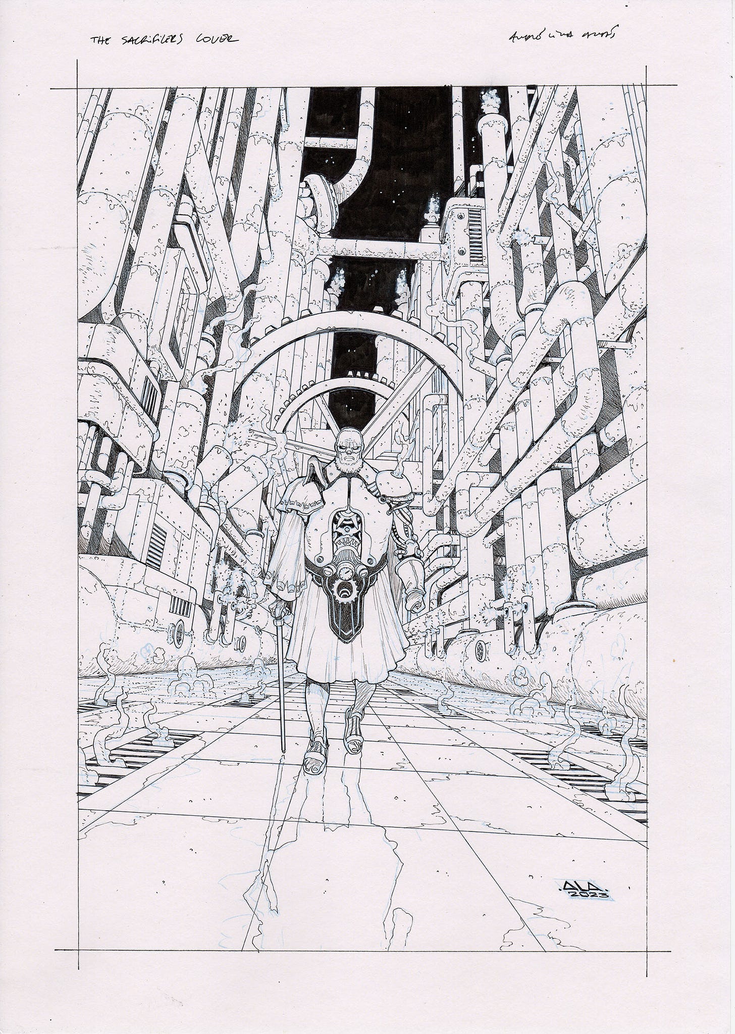
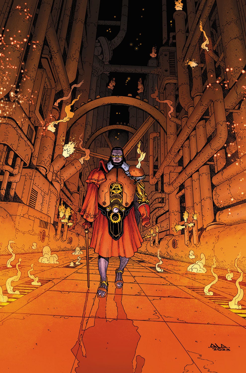
The cover for issue 11 was a very different affair. It was done months before and never used until now. At the time, Rick wanted an image with Kronious, the Gear God, which showcased his factory-like/industrial palace in some way, shape or form. It was yet to be shown in the series, so I had to come up with it. When something like this happens, I prefer to go for something that the series artist can ignore if he wants but at the same time, manages to convey the idea needed. So the choice was for a more abstract/random industrial room, instead of something very specific, like a throne room or palace entrance.
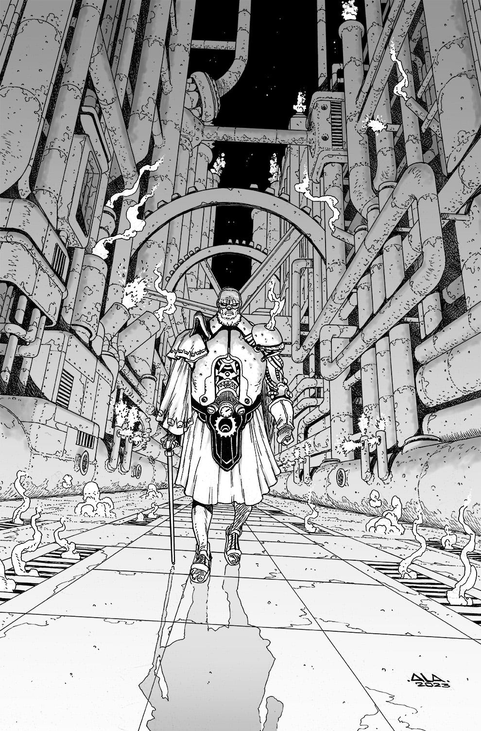
I came up with the following image, basing a lot of the tube/pipe structure on brass instruments. On the right you can see pretty much a trumpet, which I’ve played regularly for more than 20 years (a story for another day). I remember finishing the thumbnail, but feeling it a little static. To solve that, I quickly tilted the entire image. Can’t go wrong with a dutch angle.
Wanting to make sure it looked different from Phenomena, this is where I tried a watercolor brush for the first time for grey tones:
In the final image (colors by Dave McCaig), you’ll notice that the hair and beard of the character are now black. This is because between the time I drew this and its publishing date, the Gods drank an elixir that rejuvenated them, therefore requiring me and Dave to touch the image up.
—
I’ll leave you with an update of where I’m now with the work: just minutes ago I finished pencils for issue 11, so things are progressing rather fast and in a couple of months my work on this book should be done.
Much more to share in the following weeks then, I’ll see you soon.
André




Thank you for the tips!
Oh mercy, those are gorgeous.