Hello from Castrum Lusitania, my fortress in northern Portugal. Welcome to another edition of our weekly newsletter.
(I was going to begin with a couple of notes on politics, but who needs that right now? We’ve had enough articles, takes, summaries and opinions to last a lifetime. But from an European perspective, I’ll leave you with a prescient and timely article by the great Mujtaba Rahman. The title choice is debatable (it was not the author’s choice) but the content is 100% correct.)
To the point! As teased in last week’s newsletter, I’ve completed a cover for a medieval novel - the perfect excuse to show you a step-by-step. So, let’s get to it, shall we?
Novel cover: step-by-step
This one was not a normal gig - after all, my mom wrote the book. It’s not the first time we did stuff together (we worked on a series of children’s books published locally over here in Portugal, some of which you can see in a previous newsletter) but this time she wrote a full blown novel. And a medieval adventure at that - now you know where my love for all things medieval comes from.
It expertly mixes real events with fictional ones, focusing on the real life character of Teresa, Countess of Portugal (our first king’s mother) and a fictional young friar on a mission to prevent her from being killed. The Countess is a major figure in our country and particular in my home town, Ponte de Lima, as she officially declared it a town in 1125 (we’re old). And the main plot happens exactly around that moment.
Basically, there was a lot to include in the cover, so I went into a split composition that would allow me to show the main setting (Ponte de Lima) and all the main characters, separated by a neutral black strip that would harbor the title and main credits.
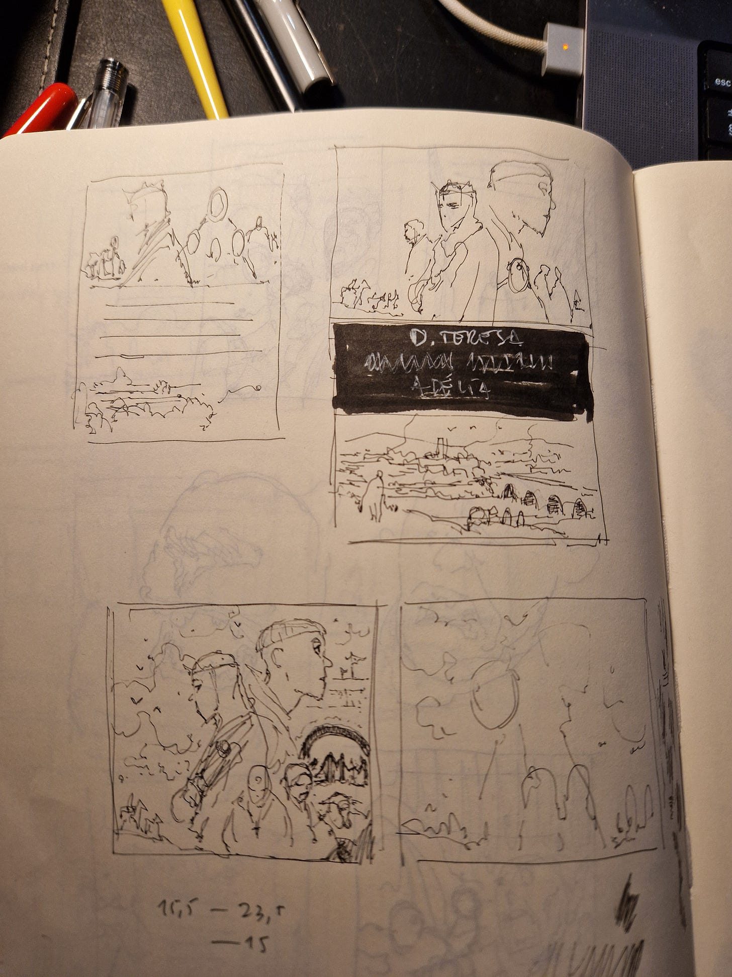
These were my first attempts at putting something together:
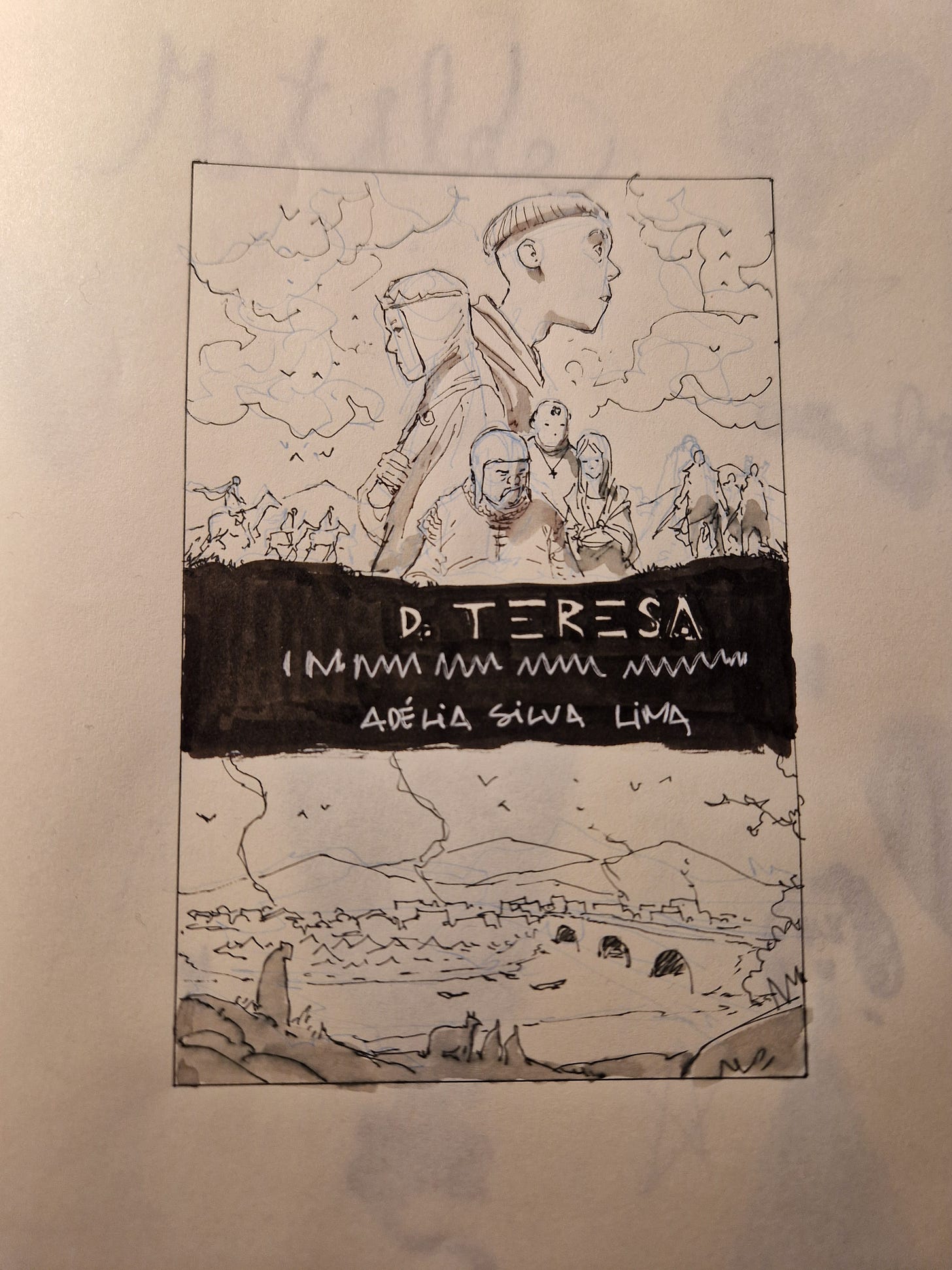
On the top right image, I knew I had nailed the bottom part, but the top bit needed some tweaking. I really liked the bottom left attempt, I just didn’t like the right side of the friar, feeling it was too busy. So I cleaned it up in a very quick study (bottom right) and did a proper sketch to show my mom:
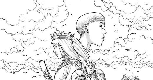
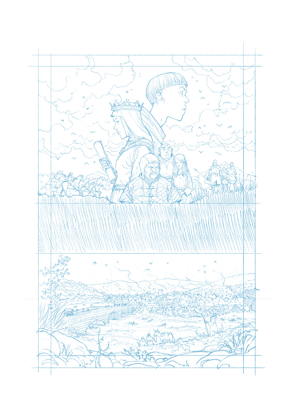
She was very enthusiastic about it. My only change to the final image was to mirror the bottom section to better reflect how usually my home town nowadays is shown (bridge to the left, town to the right). See below, pencils, inks and washes (colors will be done in the near future):
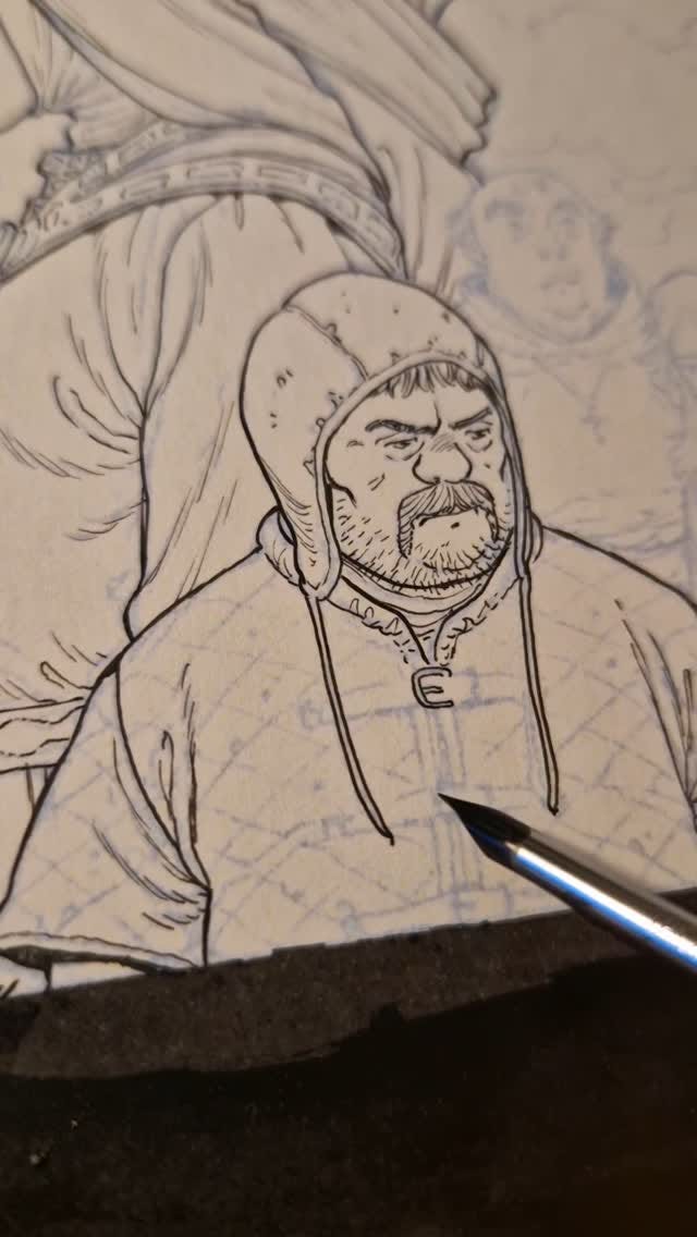
And here’s an Instagram reel of me inking bits of the central character:
—
See you next week!
André






This looks terrific!
Beautiful